Creating a Pivot Table in Google Sheets
Before creating Google Sheets Pivot table it is important to make sure your data is arranged in columns, each column has a heading, and data in each column is correctly formatted as per data type. As Pivot table does not change the formatting of data, so the Pivot table will not give correct results if data is incorrectly formatted.
In this article, we will learn how to create a Pivot Table in Google Sheets and convert our dataset into a concise and meaningful report.
Example of a Pivot Table in Google Sheets:
Let’s assume you are working a company that sells different brands of cigarettes in various regions. You have a data set of sales of cigarettes brands in different regions, and you are required to see;
- How much has each brand contributed to the company’s revenue?
- How much has each region contributed to revenue?
- What is the sales performance of each brand region wise?
Before creating a Pivot Table in Google Sheets, you must ensure that text and number fields are correctly formatted in their respective data fields as shown below.

How to create a Pivot Table in Google Sheets
Open the Google sheet that contains the sales data and select the whole data set for which you want to create a Pivot Table. Go to menu, click on the Data tab and select Pivot table… from the list of items.

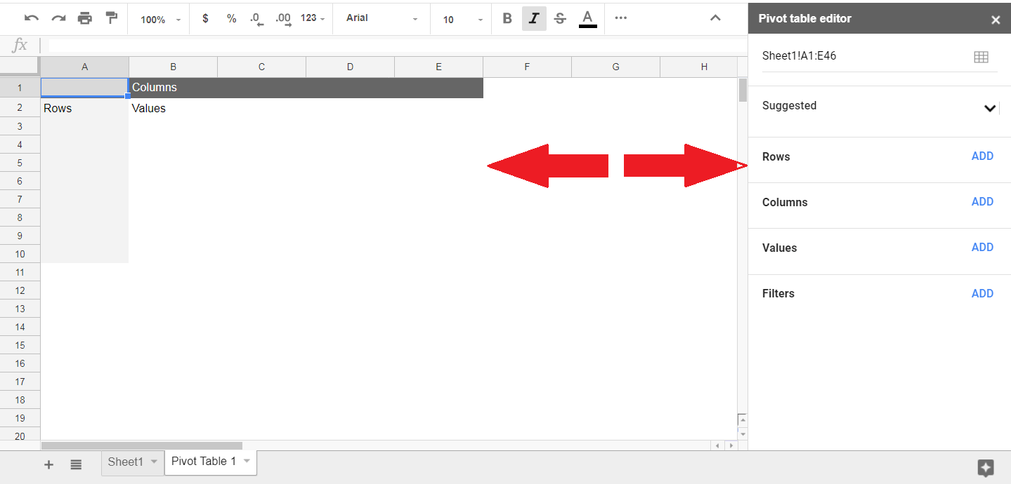
When you click on Pivot Table… option Google Sheets create a new sheet named “Pivot Table 1”. In this Pivot Table sheet, the left side is blank showing Rows, Columns, and Values area and on the right a “Pivot table editor” panel appears. Using this panel you can add the data fields to Rows, Columns, Values, and Filter areas to analyze and display your data results.

Now to get answers to your question listed above, you need to add the required data fields in appropriate areas of Rows, Columns, and Values. You can add the fields one by one by clicking on the “ADD” button in each area.
- First, add a Brand field in the Row area,
- Then, add Region field in the Column area
- Finally, add Sales field in the Values area

You can see the Google Sheets Pivot table summarizes the data by summing up the sales values of each brand for each region into a meaningful report by placing the “Brands” in Rows and “Regions” in Columns areas. It automatically generates “Grand Total” for each Region and each Brand.
From above Pivot table in Google Sheets, you can easily get answers to your listed questions;
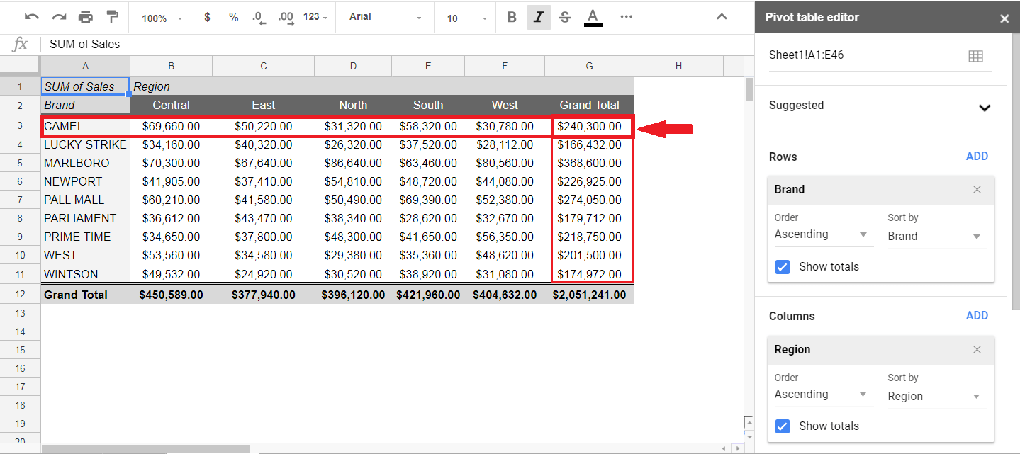
- How much has each brand contributed to the company’s revenue? If you look at “Grand Total” figure row-wise, it summarizes the total sales of each brand in all the regions. So these figures show how much each brand has contributed to total revenue.
![]()
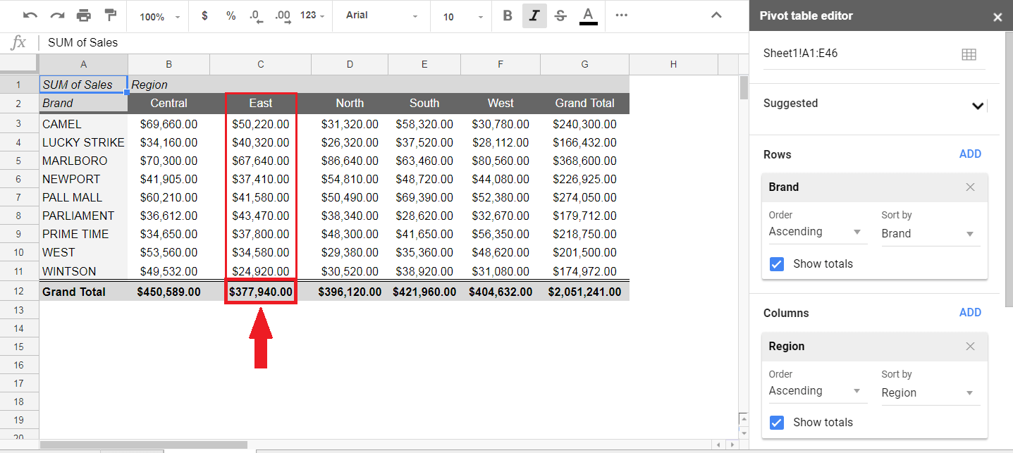
- How much has each region contributed to revenue? If you look at “Grand Total” figure column-wise, it summarizes the total sales of each region for all brands. So these figures show how much each region has contributed in total revenue.
![]()
- What is the sales performance of each brand region wise? If you want to see the sales performance of each band in a specific region, then you need to look at the figure in the intersection of row (Brand) and column (Region).
![]()
Switching Fields
You can also switch Rows and Columns fields easily to have another view of the same data by keeping the Sales field intact in Values area. Just remove the field names from Rows and Columns area by clicking on “X” mark and again add the fields in Rows and Columns areas by moving the two fields interactively.
You can see Google Sheets Pivot table flexibly switches the two fields interactively and creates another glance of results.

Show as % of…
By default Pivot table in Google Sheets summarizes the number as SUM and shows as a number. Instead of showing the sum of Sales figures, you can also show the summarized data as % of the row, % of column and % of Grand Total. To do that you need to place the number field in the Values area, click on the drop-down arrow of “Show as” region and select desired option.
For example, you want to show your data as “% of Grand Total” then you can easily do that by selecting this option from the list of items in “Show as” region.

When you select this option, the Google Sheets Pivot table converts the sales figures as % of Grand Total of sales. It generates another view of the results, and you are able to see the data from a different angle. Percentage figures in row-wise Grand Total show how much each brand has contributed in total revenue, while percentage figures in column-wise Grand Total show how much each region has contributed in total revenue. Depending upon your requirement, you can flexibly change the look and feel of your data in the Google Sheets Pivot table.

Summarize By
In a Google Sheets Pivot table, you can summarize your result by a number of ways. It has many options including SUM, COUNT, COUNTA, Average, Min, Max, etc. Depending upon your data set you can easily choose the desired method to summarize your data. In this example, you can summarize your sales figure as Average.
For example, you want to summarize your data by calculating the Average sales of each brand across all regions. To do that you need to add a Brand field in Rows area and Sales field in Value area. By default Google Sheet Pivot table summarizes numbers as SUM, click on the drop-down arrow of “Summarize by” region and select “Average.”

Pivot table in Google Sheets flexibly summarizes the data by calculating average sales of each brand across all the regions. You can disable column-wise Grand Total by unchecking “Show totals” in Rows area. In this way, results can be viewed differently using the same data set.

Sort by
By default Pivot table in Google Sheets sorts the field’s data in ascending order, and by name of that field, but you can change data layout by selecting other available options. To do that, you need to select the appropriate option in “Order” and “Sort by” regions of Rows and Columns areas.
For example, you want to sort the resulting figures of sales in Ascending or Descending order by selecting “Sort by” option of “Average of Sales”, in Rows area you will select “Order” as descending and “Sort by” as “Average of Sales”. It will sort the whole data in descending order by brands’ average sales figure as shown below.

Suggested Calculations
The Google Sheets Pivot table editor panel also contains some suggested calculations based on the nature of selected data to further make it easy for you to quickly have a glance at your data. If you select any of these suggested calculations, the Pivot table automatically adds the required data fields in appropriate pivot table editor areas and make suggested calculations for you, as shown below.

Suppose you want to see one of the suggested calculations “Sum of Sales of each Region.” When you click on this suggested calculation, Google Sheets Pivot table automatically adds the required data field in their respective areas and makes calculations for you.

In this article, we have learned how to create a Pivot table in Google Sheets and have tried to use as many features as available in Google Sheets Pivot table depending upon the nature of our data set. Google Sheets Pivot table has some limitations as compared to Excel Pivot Tables, like creating “Consolidated Pivot Table” from multiple data sheets, and creating “Calculated Items” within the Pivot table. These features are not currently available in Google Sheets Pivot table, but it has almost all the other features which are supported in Excel Pivot tables.


Leave a Comment