

When we have two different yet related pieces of information then we need to show them on Y-axis on a single chart. Excel secondary axis allows us to show two Y-axis data series with two different scales using the same X-axis. We will learn how to add secondary axis in Excel based on following versions;
- Using Excel 2010 and Earlier Versions
- Using Excel 2013 and Later Versions
 Figure 1. How to Add Secondary Axis in Excel
Using Excel 2010 and Earlier Versions
We can create one data series at a time on a secondary axis. But when the values of data series vary then we can plot more than one data series on secondary axis Excel. Suppose we have monthly revenue and profit margin data series in terms of dollar amounts and percentages in a table range B1:D7.
 Figure 2. Data Series Table
Creating a Chart
We select the data table B1: D7 and create the 2-D chart in Excel 2010 and earlier versions by following these steps;
- Click on Insert tab and go to Charts section
- Click on Column and select 2-D Clustered Column Chart
 Figure 3. Selecting 2-D Clustered Column Chart
A 2-D Clustered Column chart is generated showing “Months” in X-axis and Revenue on Y-axis (primary axis). But we need to show “Profit Margin” data series on the secondary axis.
 Figure 4. Creating 2-D Clustered Column Chart
Add Secondary Data Series
To add the second Y axis Excel 2010, we must have the 2-D chart secondary axis are not supported in 3-D charts. We need to follow the below steps to add secondary data series (Profit Margin) on Y-axis;
- Click the Chart
- Go to Chart Tools > Select Format tab
- From Current Selection click on Chart Element drop-down arrow
- Select series “Profit Margin”
 Figure 5. Adding a Secondary Data Series
- Click on Format Selection in Current Section to open Format Data Series dialog
- Select Secondary Axis from Plot Series On options
 Figure 6. Format Secondary Data Series
 Figure 7. Secondary Axis Excel
- In the Chart Area, click on secondary data series bar (Profit Margin)
- Go to Design tab > From Type section click on Change Chart Type
- Select the Line Chart type for Excel Secondary Axis
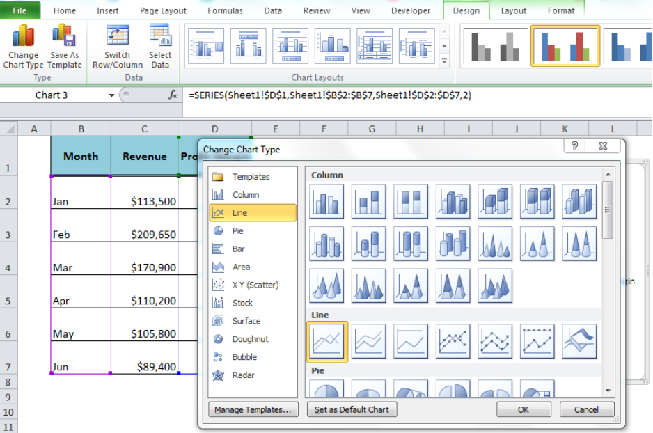 Figure 8. Changing Chart Type For Secondary Data Series
 Figure 9. Secondary Axis Excel 2010
Using Excel 2013 and Later Versions
To add secondary axis Excel 2013 and later versions we need to follow the following procedure while setting up the secondary data series (Profit Margin) in 2-D Clustered Column chart.
- Select Data Table B1: D7 and Insert 2-D Clustered Column Chart
 Figure 10. Inserting 2-D Column Chart
- Click on chart to open Chart Tools. Go to Design > Change Chart Type.
 Figure 11. Change Chart Type
- Select Combo > Cluster Column – Line on Secondary Axis.
- Choose Secondary Axis for the data series “Profit Margin”.
- Click the drop-down arrow and choose Line.
- Press the OK button.
 Figure 12. Add Secondary Axis Excel 2013
 Figure 13. Secondary Axis Excel
Most of the time, the problem you will need to solve will be more complex than a simple application of a formula or function. If you want to save hours of research and frustration, try our live Excelchat service! Our Excel Experts are available 24/7 to answer any Excel question you may have. We guarantee a connection within 30 seconds and a customized solution within 20 minutes.


Leave a Comment