

We can use the Excel Quick Analysis tool to create different kinds of charts. The Quick Analysis tool also features other options like Totals, Charts, Formatting, Tables, and Sparklines. In this tutorial, we will discover how to use the quick analysis tool to create and modify our charts.
 Figure 1 – Excel Quick Analysis tool
Using the Quick Analysis Button for Conditional Formatting
- We will highlight the cells of data we want to analyze
- We will find the Quick Analysis tool at the bottom of the data. If we don’t find the Quick Analysis tool at the bottom of the data, we can turn it on by pressing Ctrl + Q
 Figure 2 – Setting up data for Quick Analysis
- In the Quick Analysis toolbar, we will click on Formatting
 Figure 3 – Using the Analysis toolbar
- In the Formatting tab, we will select Color
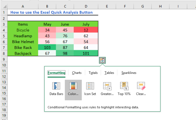 Figure 4 – Selecting Color in the Formatting Tab
- Alternatively, we can use other options such as Icon Sets
 Figure 5 – Selecting Icon sets from the Formatting Tab
Using the Excel Quick Analysis tool to add Chart
- We will highlight the cells we wish to analyze
- We will click Charts in the Quick Analysis tool
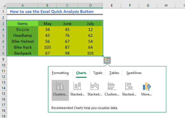 Figure 6 – Using Charts in the Quick Analysis Tool Bar
- We can click on the charts displayed in the Charts Tab or select More charts to check other chart options in the Insert Chart window
 Figure 7 – Excel Quick Analysis
- If we pick the first chart, we will have this result
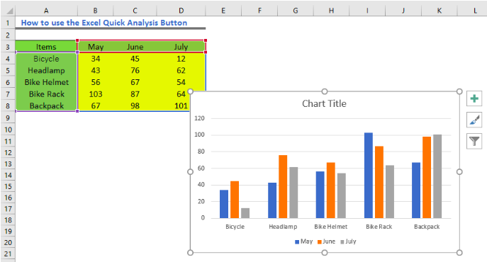 Figure 8 – Insert Chart with Quick Analysis button
Add Sparklines
- To add sparklines to our data, we will simply select the Sparklines option.
 Figure 9- Add sparklines in Excel
- Next, we will click on the kind of sparkline we want to add to our chart
- We will select OK.
 Figure 10 – Insert Sparklines with Quick Analysis
Quick Analysis tool For Totals
- If we highlight the range we wish to highlight and click on Totals, we will see functions such as Sum, Count, Average and many more.
 Figure 11 – Insert Sum, Count, Average with Quick Analysis
- In the tutorial, we will click SUM to achieve this result
 Figure 12 – Sum with Quick Analysis
Tables
- We can also use the Quick analysis tool to filter, sort or summarize our data. In the Quick Analysis button, we have both the Table and PivotTable options. To convert data to a Pivot Table, we can click on the Table icon and select Blank.
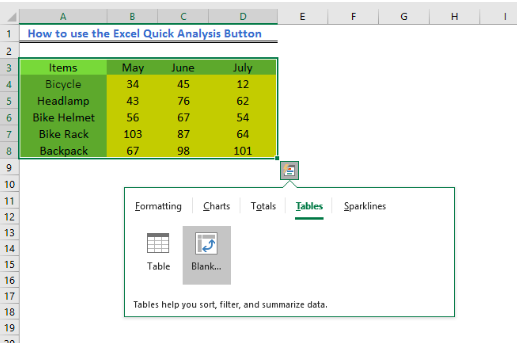 Figure 13 – Insert Pivot Table
Instant Connection to an Expert through our Excelchat Service
Most of the time, the problem you will need to solve will be more complex than a simple application of a formula or function. If you want to save hours of research and frustration, try our live Excelchat service! Our Excel Experts are available 24/7 to answer any Excel question you may have. We guarantee a connection within 30 seconds and a customized solution within 20 minutes.


Leave a Comment