

Dot plots are very essential when it comes to representing data. Millions of Excel users all over the world find it easy to interpret data presented in a dot plot than any other form. But not so many people know how to do a dot plot. In this post, we shall look at easy steps that you can take to make dot plots.
Step 1: Prepare your data
The first thing that you need to do when creating a dot plot is to have the data that you intend to use for your dot plot.
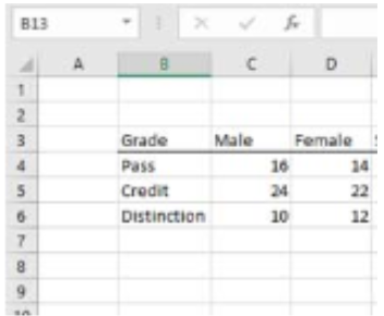 Figure 1: Data to use for dot plot
Step 2: Create a Spacing column
After having our data ready, the next thing we need to do is add a column in the data table. This column we shall call it Spacing column as shown in figure 2 below;
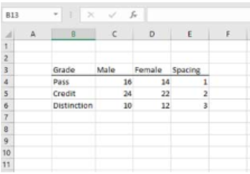 Figure 2: Spacing column with numbers
In the Spacing column, add a simple sequence of numbers
Step 3: Insert scatter plot
We need to create a scatter plot using the first series column and the Spacing column. In our case, the first series column is the Male column.
To create a scatter plot of the Male and Spacing columns, we need to select both of them first. To do this, simply select the Male data and then press and hold the Ctrl key, then select Spacing data. After that, select scatter plot from the design tab in the ribbon.
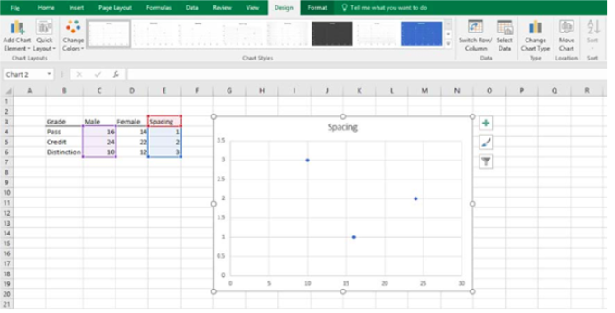 Figure 3: Scatter plot
Step 4: Name the axis
Click the Select Data button from the Ribbon chart tools design tab. From here, click the Add button and then fill the text values. The series name should be Female for our case, Series X values should be D4 to D6 and series Y value, which is the spacing data shall be E4 to E6. Then click ok and ok again.
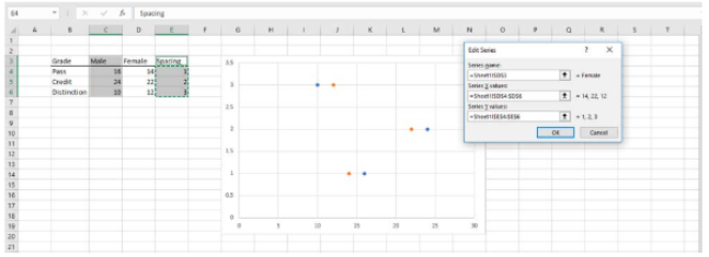 Figure 4: Add names to the plot
Formatting the dot plot
By clicking Ok in the above procedure, you would have created a dot plot. The next thing you do is to format the dot plot to fit your needs. Note that when creating a dot plot, we do not need a legend. If you have it, then you need to delete it.
We have to increase the size of the dots as well as add data labels. This is simply done by right-clicking on a dot and selecting Data series option from the menu.
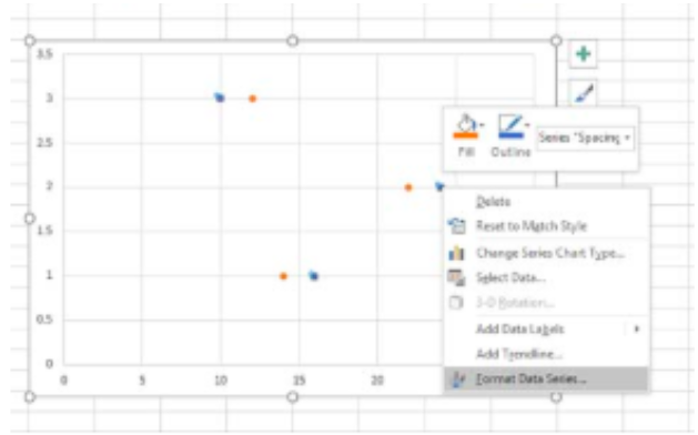 Figure 5: Formatting dot plots
You will be able to do all the formatting you need via the Marker options that will appear on the right of the plot.
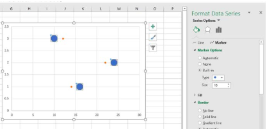 Figure 6: Format Data Series options
You should follow the same procedure as above to format data labels as well.
Note that to do any formatting, all you need to do is right-click on what you want to format, then select it from the window.
Instant Connection to an Expert through our Excelchat Service
Most of the time, the problem you will need to solve will be more complex than a simple application of a formula or function. If you want to save hours of research and frustration, try our live Excelchat service! Our Excel Experts are available 24/7 to answer any Excel question you may have. We guarantee a connection within 30 seconds and a customized solution within 20 minutes.


Leave a Comment