

If you want to check the latest trends in Excel, then the best way to go about it is to charts templates. And while Excel has many options to help us create chart templates for our various reasons, unless you know how to create and use a chart template, these powerful features might not be as useful to you. In this post, we shall look at how to create and use a chart template.
Creating graph templates
As already mentioned above, creating Microsoft graphs templates is not as hard as many would want to believe. All you need in order to come up with chart templates is an understanding on how to use the features available to us. Below is a procedure of how to create a graph template in any of the Excel versions.
Step 1: Provide the data
The first thing that you need to do is to provide the data that you want Excel to pull from. When entering your data into Excel, ensure that you have provided labels for each of the columns. This is necessary as it will help you translate the data into a graph template.
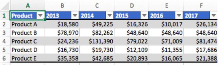 Figure 1: Data to use
Step 2: Select the range to create chart or graph template from the worksheet
Now that you have the data that you want to use when creating free charts, the next thing is to select the range of data that you intend to use. You can do this by simply highlighting the data.
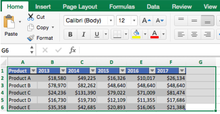 Figure 2: Selecting range to use to create chart template
Once you have selected the data to use to come up with graph template, you are now ready to select any of the chart types available. Note that you can even create a line graph template with the data.
Step 3: Selecting the chart type
As mentioned, with the data highlighted, you can create any type of chart template with it. To proceed, click on the Insert tab. You will be presented with several chart options. Click the column chart icon and select Clustered column.
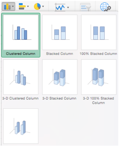 Figure 3: Select the chart type
The moment you select clustered column graph Excel will automatically create a clustered chart for the data you had selected earlier on. Give it your preferred name.
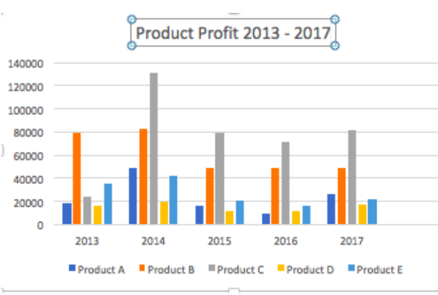 Figure 4: Chart template
You can customize the graph template by using the Chart Design as well as the Format tabs.
If you have some more information that you need to add to the graph in order to make it more clear, you can do so by adding chart elements. Simply click on the Add Chart Element dropdown menu.
Creating line graph templates is as easy as following the steps highlighted above.
Conclusion
Excel groups the various graphs in charts. Whether you want to create a line graph template, a bar graph template or any other type of chart, all you have to do is follow the procedure highlighted in this tutorial and choose your preferred chart template to use.
Instant Connection to an Excel Expert
Most of the time, the problem you will need to solve will be more complex than a simple application of a formula or function. If you want to save hours of research and frustration, try our live Excelchat service! Our Excel Experts are available 24/7 to answer any Excel question you may have. We guarantee a connection within 30 seconds and a customized solution within 20 minutes.


Leave a Comment