

We can use a thermometer chart when we want to track a given goal with the achievement we have made within a specified time. Usually, we use this chart when we want to make a comparison between the actual value and a target value. An example of an instance where we would need a thermometer goal chart is when analyzing sales performance, where we shall create a sales thermometer, analyzing employee satisfaction rating and so on. In this post, we will learn how to make a goal chart to be used for comparison purposes.

Figure 1. Final result
Step-by-step guide on how to a goal chart
Notice that in Excel, we do not have default options that one can use to easily create a goal thermometer. We need to follow a few simple steps as explained below;
Step 1: Prepare the goal chart data
The very first step when making a thermometer chart is to have the goal chart data. For purposes of this tutorial, we shall use the data below;
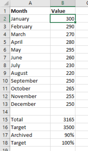 Figure 2: Data chart to make thermometer graph
It is essential to remember that our target percentage will always be percent. And to calculate the archived percentage, we need to divide the total by the target, then multiply the answer by 100.
Step 2: Create stacked column chart
The next step we need to do is to create a basic chart using the thermometer chart data we have prepared. This is simply an Excel stacked column chart.
To create a stacked column chart, follow the procedure below;
- Select the “Archived” and “Target” percentages
- Click the “Insert Tab”
- Click the “Insert column or bar chart” icon from the chart group
- From the drop-down menu, click “2D clustered column” chart.
At this point, you should have a goal graph that looks like the one in figure 3 below;
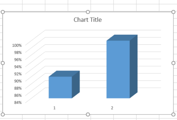 Figure 3: Stacked column goal graph
Step 3: Switch row/column
To do this, we need to right-click on the thermometer goal graph and then click on “Select Data”
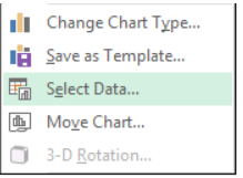 Figure 4: Selecting data
Then click on “Switch row/column” from the select window that appears. And then click OK. The resulting thermometer chart will look like the one below;
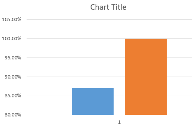 Figure 5: Switched row/column
We then need to format the second column, the one in orange color. To do this, we will right-click on the column and then select “format data series”
Select the “Secondary axis from the dialog box that appears. This will make sure that both of the bars align with each other.
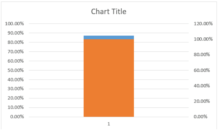
Figure 6. Aligned bars
We now have two vertical axes, the left axis and the right axis. These two vertical axes have different values. We need to format the left axis. To do this, we need to right-click on it and select format axis.
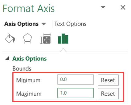
Figure 7. Format Axis
We then need to change the maximum bound value to 1, and minimum to 0. And this should be done manually, even if the figures are already there.
We then need to delete the right axis. This is done by simply selecting it and hitting the delete key.
At this point, we only have one chart visible, we need to format this chart. To do this, right-click on the chart and select “format data series.”
Then make the do the following;
Fill: No Fill
Border: Solid Line
Ensure that the border color is the same as that of the actual value bar. You also need to delete the chart title, grid lines, both vertical and horizontal axis as well as the legend. At the same time, we have to manually resize the graph to look like a thermometer graph. After resizing, the thermometer graphic should look like the one below;
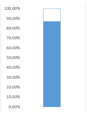
Figure 8. Resizing
We now have to format the left-axis. Right-click on it and select “Format axis”. In the pop-up window that shows up, select the Major Tick Mark Type as “Inside”.
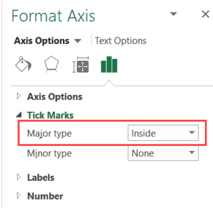
Figure 9. Format Axis
The next step is to select the chart outline. To do this, right-click on the chart and then select the Chart Area.
A task panel will show up, select the following changes,
Fill: No fill
Border: No Line
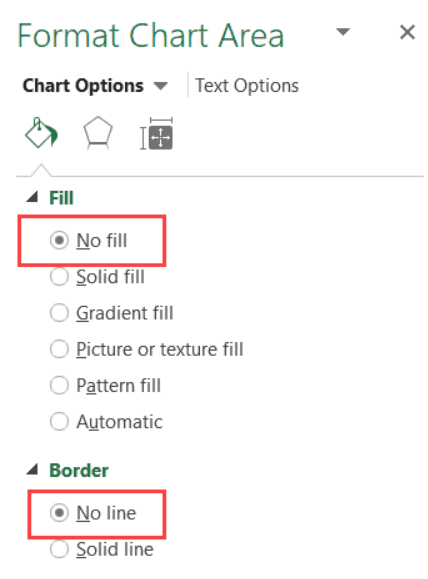
Figure 10. Format Chart Area
To make the thermometer graph, we need to put a circle at the bottom of the thermometer graph. To do this, we need to click on the Insert tab, then insert a circle from the drop-down menu that comes up. The circle should be of the same color as the thermometer graph itself.
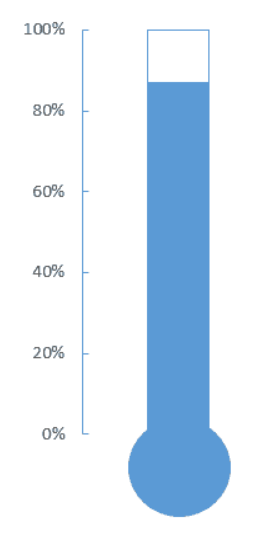
Figure 11. Final result
Instant Connection to an Expert through our Excelchat Service
Most of the time, the problem you will need to solve will be more complex than a simple application of a formula or function. If you want to save hours of research and frustration, try our live Excelchat service! Our Excel Experts are available 24/7 to answer any Excel question you may have. We guarantee a connection within 30 seconds and a customized solution within 20 minutes.


Leave a Comment