

We can make an axis break in a graph when we wish to make precise analysis about particular conditions. We can use this when we have some large or random data in our graph that disrupts its flow.
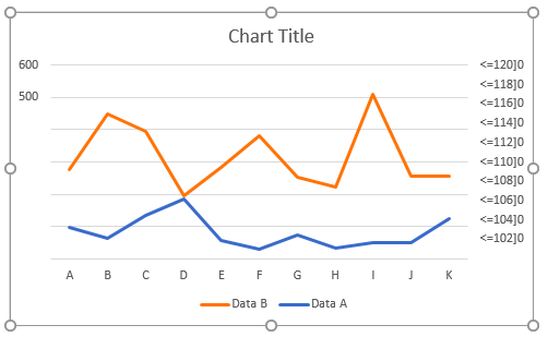 Figure 1 – How to add a break in a graph
Insert axis break using a secondary axis in chart
- We will set up our data as shown in figure 2
 Figure 2 – Setting up data to scale break
- Next, we will highlight the data, Insert a line chart by going to the Insert Tab, and select Insert Line chart.
 Figure 3 – How to make a break in a graph
- Our chart will look like this:
 Figure 4 – Insert chart breaks
- In the chart, we will right-click below the series and select Format Data Series
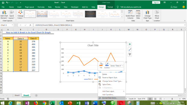 Figure 5 – Scale break in excel
- In the Format Data Series dialog box, we will mark the Secondary Axis option
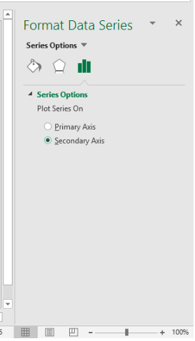 Figure 6 – Split axis in excel
- We will close the dialog box
 Figure 7 – How to break y axis in excel
- We will right-click on the Secondary vertical axis and select Format Axis from the drop-down menu
 Figure 8 – How to add a break in excel graph
Depending on our Excel Version, we will proceed as follows:
In Excel 2007 and 2010 Format Axis dialog box:
- We will click on Axis Option in the left bar and mark the Fixed option behind the Maximum. Then, we will type 200 into the box.
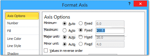 Figure 9 – How to insert excel axis break
- We will click on Number in the left bar and enter the code [<=100]0;;; into the Format code box and select the Add Button to close the dialog window.
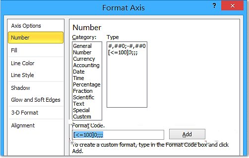 Figure 10 – Scale break excel
- We will right click on the Primary Vertical axis in the chart and select the Format Axis to open the Format Axis dialog box. Next, we will click Number in the left bar and type [>=500]0;;; in the Format Code box and click on the Add button to close the dialog box.
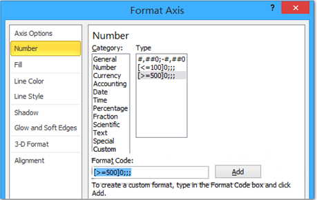 Figure 11 – How to insert chart breaks
In Excel 2013 or higher Format Axis dialog box, we will go to the Bound section and type 200 into the Maximum Box
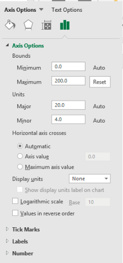 Figure 12 – How to scale break in Excel 2016
- We will go to the Number group, we will pick the Custom Category and type <=100]0;;; in the Format code box.
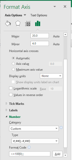 Figure 13 – How to split axis in excel
- Lastly, we will click the Add button to close the dialog window
- We will right-click on the primary vertical axis (the left one) in the chart and select the Format Axis to open the Format Axis Window.
 Figure 14 – Split axis
- Next, we will enter [>=500]0;;; into the Format code box and click the Add button to close the pane.
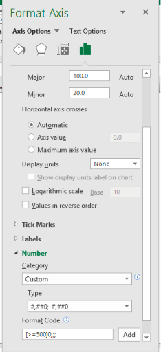 Figure 15 – Make Breaks in Excel
Our Excel Chart will now look like this:
 Figure 16 – How to make a break in a graph
Instant Connection to an Excel Expert
Most of the time, the problem you will need to solve will be more complex than a simple application of a formula or function. If you want to save hours of research and frustration, try our live Excelchat service! Our Excel Experts are available 24/7 to answer any Excel question you may have. We guarantee a connection within 30 seconds and a customized solution within 20 minutes.


Leave a Comment