

We can use a Radar chart or spider chart to show ratings or visible concentrations of strength and weaknesses in our data. We can also use the radar chart to do performance analysis of an employee, student, satisfaction of a customer and many other rating conditions across multiple categories. In this tutorial, we will illustrate how to create a spider or radar chart.
 Figure 1 – Creating a spider chart
How to Make a Radar Chart for Multiple categories
- We will create a data sheet (table) as displayed below.
 Figure 2 – Spider chart data
- We will go to the Insert tab, select Other Charts and select Radar with Marker Chart. If we are using Excel 2016, we can find Radar with Marker under the Waterfall group in the Insert tab
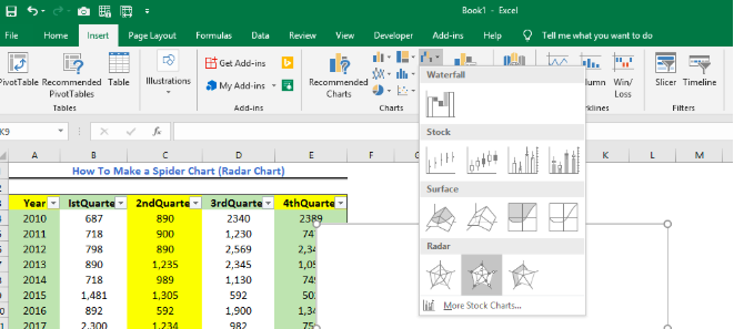 Figure 3 – Making a spider chart
- This will create a blank Radar chart in our sheet.
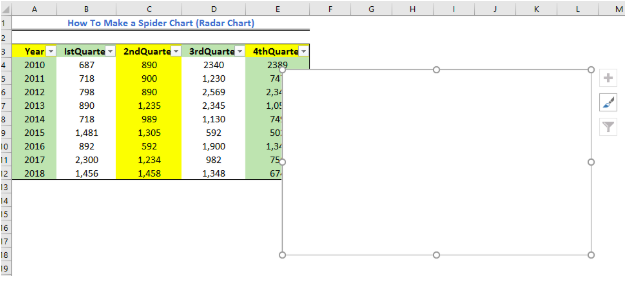 Figure 4 – Creating a blank radar chart
- We will right-click on our chart and click on Select data
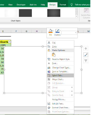 Figure 5 – Making a spider graph
- We will click on the Add button and click on Cell B3 to enter the series name for 1st Quarter. Next, we will highlight Cells B4:B12 to enter the values for our series. Then we will click OK.
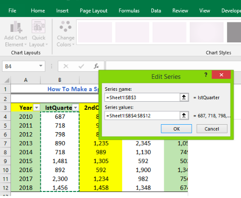 Figure 6- Using a radar chart
- We will repeat the procedure for all the quarters.
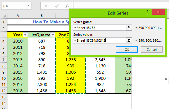 Figure 7 – Spider web chart range
- We will click OK.
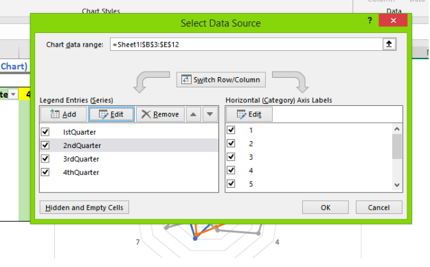 Figure 8 – Radar charts using four categories
- Now, we will enter the data for the Horizontal category.
- We will click on Edit under the Horizontal Category Axis labels. Next, we will highlight Cell A4:A12 to enter the range.
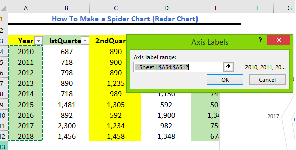 Figure 9 – Spider charts axis labels
- Finally, we will click OK to go back to the Select Data Source window.
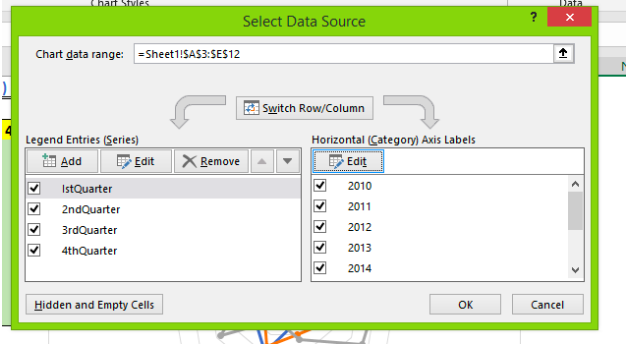 Figure 10 – How to make a radar chart
- Now, we will click OK to view our chart.
 Figure 11 – Making a radar chart
Formatting the Radar Chart
We can always format our chart to display what we want.
- To add a chart title, we will go to the Design tab and select the Add Chart Element button. Next, we will enter the name for our chart.
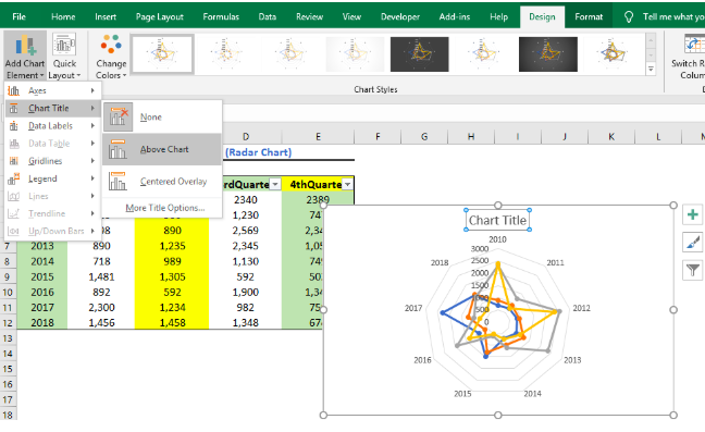 Figure 12 – Spider web chart
- We can also format the marker lines. We will right-click on each line, click Format Data and then select No Line (or solid line as we wish).
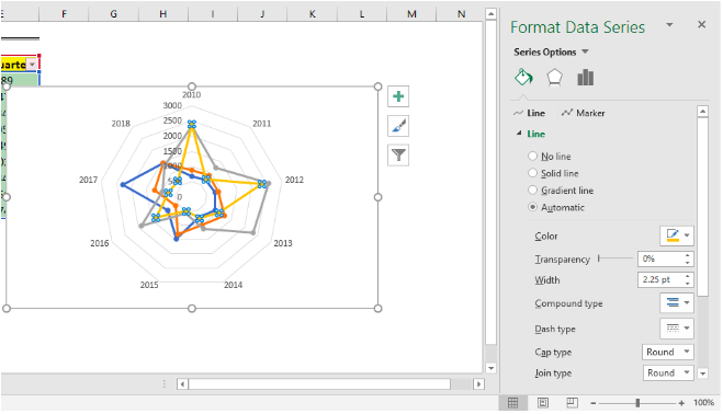 Figure 13 – Formatting data series
Explanation
Like the column chart or other 2-dimensional charts, we also have an X and Y axis in the Radar chart. But in the radar chart, the X-axis is positioned at the end of the spider while the Y-axis is positioned at each step. The zero points of the radar chart begin from the center of the wheel and the closer the spike to the end of the spike, the higher the value.
Therefore, in our radar chart, the years we see at the ends of the charts is the X-axis while the Y-axis is represented by the numbers 0 to 3,000.
 Figure 14 – How to make web chart
Instant Connection to an Excel Expert
Most of the time, the problem you will need to solve will be more complex than a simple application of a formula or function. If you want to save hours of research and frustration, try our live Excelchat service! Our Excel Experts are available 24/7 to answer any Excel question you may have. We guarantee a connection within 30 seconds and a customized solution within 20 minutes.


Leave a Comment