Creating a sine graph in excel might be a little bit hard if you do not understand the concept of the trigonometric itself. But with some knowledge about the trigonometric equations like the sine, cosine and tangent, you can easily draw the graph of either the sine, cosine or tangent in excel. This post will guide you on how to create a sine graph in excel.
Step 1: Get your data in an excel table
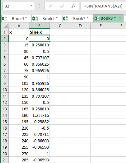
The first thing you need to do is have your data in an excel table. The data here refers to the angles in degrees, which needs to be converted into radians. For illustrative purposes, we have the table below to show our values in degrees in column A and the sine of the degrees in radians in column B.
 Figure 1. Setting up the data
Step 2: Come up with graph
The next thing we need to do is use the Excel built-in graphs to come up with a graph that suits our data.
To do this, we are required to head to the Insert at the top, and click on the charts.
 Figure 2. Insert graph
Step 3: Select the graph that you want to use to create the sine graph
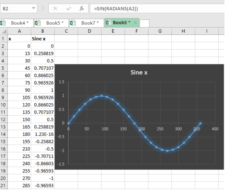
 Figure 3. Final result
- The Excel built-in charts will help you create a sine graph with the data you have provided.
- Note that the sine graph starts at zero and cuts the X-axis at zero.
- The highest point of the sine graph, i.e. Y-axis, is 1, thus it will oscillate between 1 and -1.
Instant Connection to an Expert through our Excelchat Service
Most of the time, the problem you will need to solve will be more complex than a simple application of a formula or function. If you want to save hours of research and frustration, try our live Excelchat service! Our Excel Experts are available 24/7 to answer any Excel question you may have. We guarantee a connection within 30 seconds and a customized solution within 20 minutes.


Leave a Comment