

We can make a scatter plot in Excel or an xy scatter chart to assess and monitor trends and correlations between variables. This tutorial will walk all levels of excel users on the simple procedure of how to make a scatter plot in Excel.
 Figure 1 – How to Create Scatter Plot
How to Create a Scatter Plot in Excel With 2 Variables
- We will use the 2-variable data below to create a scatter plot in Excel
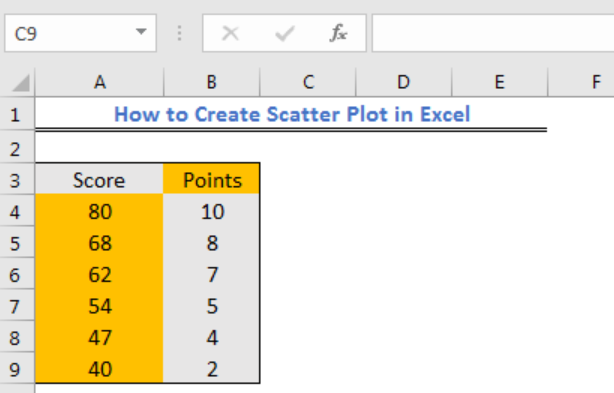 Figure 2 – Two Variable data to create Excel scatter plot
- We will highlight the data range A3:B9
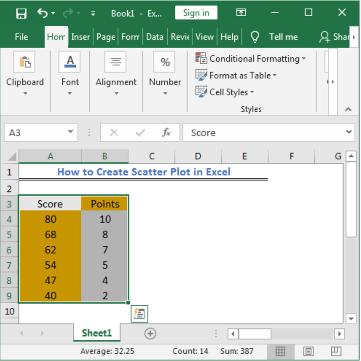 Figure 3 – Highlight data range to create xy scatter plot in Excel
- We will click the Insert tab
- For users of Excel 2010 or earlier, we will look for the Scatter group under the Insert Tab
- For users of Excel 2013 and later, we will go to the Insert Tab and select the X and Y Scatter chart from the Charts group. In the drop-down menu, we will choose the second option.
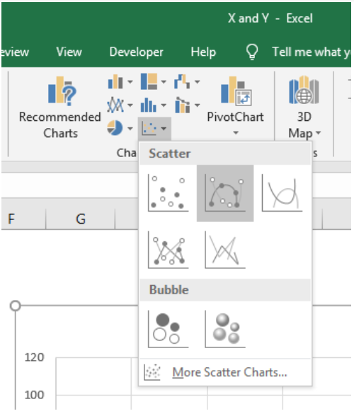 Figure 4 – Scatter with Smooth Lines and Markers
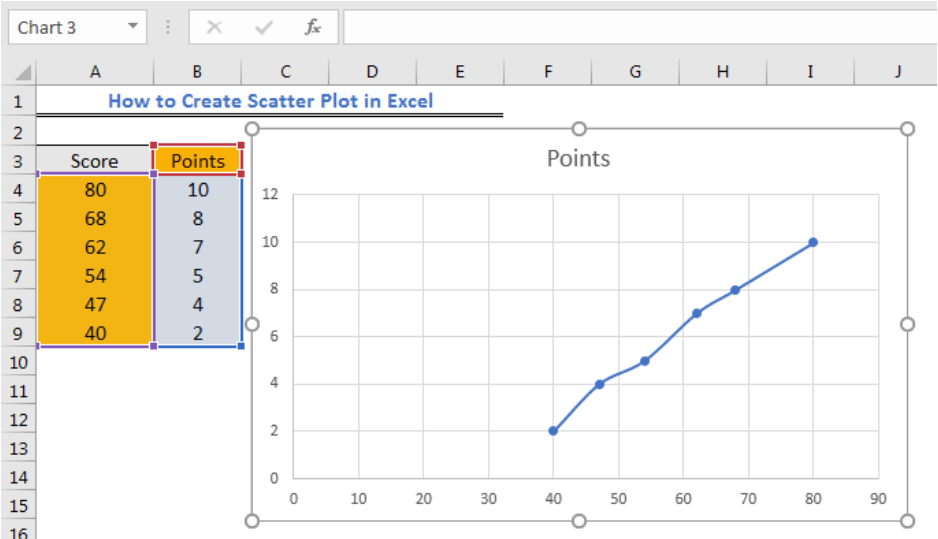 Figure 5 – XY scatter plot in Excel
Excel Scatter Plot Axis Labels
We can label the axis of the scatter graph in Figure 5 by doing the following:
- We will click on the scatter graph and check the Axis Titles box in the Chart Element Group
 Figure 6 – Scatter plot axis labels
- We will add the title to the X and Y axis
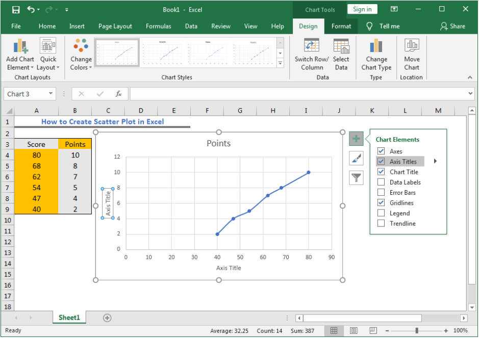 Figure 7 – Add title
 Figure 8 – Added scatter plot axis labels
Instant Connection to an Excel Expert
Most of the time, the problem you will need to solve will be more complex than a simple application of a formula or function. If you want to save hours of research and frustration, try our live Excelchat service! Our Excel Experts are available 24/7 to answer any Excel question you may have. We guarantee a connection within 30 seconds and a customized solution within 20 minutes.


Leave a Comment