

We can use Excel to plot XY graph, also known as scatter chart or XY chart. With such charts, we can directly view trends and correlations between the two variables in our diagram. In this tutorial, we will learn how to plot the X vs. Y plots, add axis labels, data labels, and many other useful tips.
 Figure 1 – How to plot data points in excel
Excel Plot X vs Y
We will set up a data table in Column A and B and then using the Scatter chart; we will display, modify, and format our X and Y plots.
- We will set up our data table as displayed below.
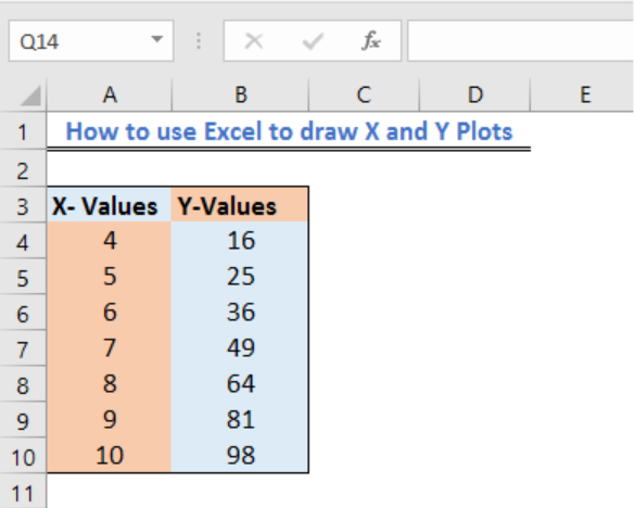 Figure 2 – Plotting in excel
- Next, we will highlight our data and go to the Insert Tab.
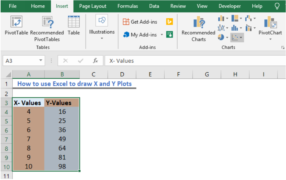 Figure 3 – X vs. Y graph in Excel
- If we are using Excel 2010 or earlier, we may look for the Scatter group under the Insert Tab
- In Excel 2013 and later, we will go to the Insert Tab; we will go to the Charts group and select the X and Y Scatter chart. In the drop-down menu, we will choose the second option.
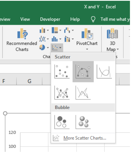 Figure 4 – How to plot points in excel
- Our Chart will look like this:
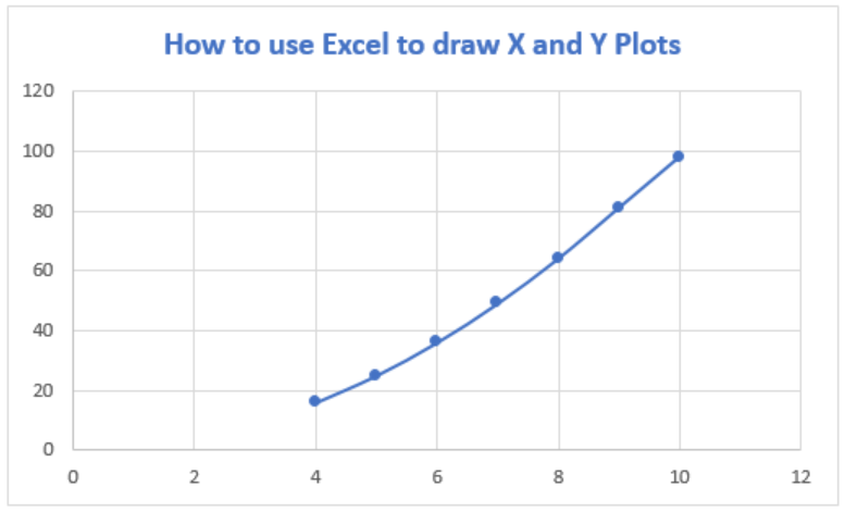 Figure 5 – How to plot x and y in Excel
Add Axis Titles to X vs Y graph in Excel
- If we wish to add other details to our graph such as titles to the horizontal axis, we can click on the Plot to activate the Chart Tools Tab. Here, we will go to Chart Elements and select Axis Title from the drop-down lists, which leads to yet another drop-down menu, where we can select the axis we want.
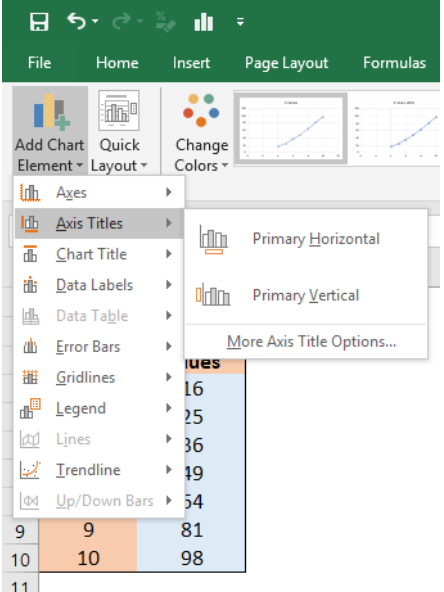 Figure 6 – Plot chart in Excel
- If we add Axis titles to the horizontal and vertical axis, we may have this
 Figure 7 – Plotting in Excel
Add Data Labels to X and Y Plot
We can also add Data Labels to our plot. These data labels can give us a clear idea of each data point without having to reference our data table.
- We can click on the Plot to activate the Chart Tools Tab. We will go to Chart Elements and select Data Labels from the drop-down lists, which leads to yet another drop-down menu where we will choose More Data Table options
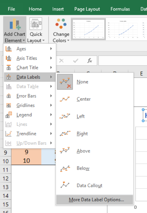 Figure 8 – How to plot points in excel
- In the Format Data Table dialog box, we will make sure that the X-Values and Y-Values are marked.
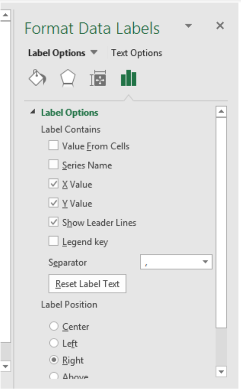 Figure 9 – How to plot x vs. graph in excel
- Our chart will look like this;
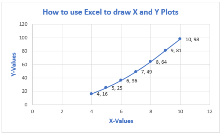 Figure 10 – Plot x vs. y in excel
- To Format Chart Axis, we can right click on the Plot and select Format Axis
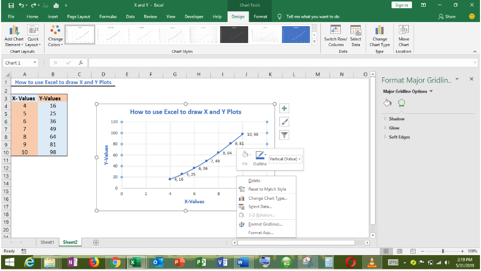 Figure 11 – Format Axis in excel x vs. y graph
- In the Format Axis dialog box, we can modify the minimum and maximum values.
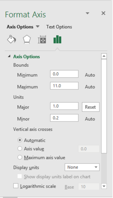 Figure 12 – How to plot x vs. y in excel
- Our chart becomes;
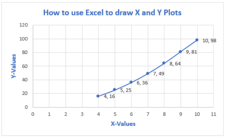 Figure 13 – How to plot data points in excel
Instant Connection to an Expert through our Excelchat Service
Most of the time, the problem you will need to solve will be more complex than a simple application of a formula or function. If you want to save hours of research and frustration, try our live Excelchat service! Our Excel Experts are available 24/7 to answer any Excel question you may have. We guarantee a connection within 30 seconds and a customized solution within 20 minutes.


Leave a Comment