

Pivot table is one of the most useful features in Excel to arrange data entered in the Excel worksheet to make it simpler to analyze.
Pivot tables are usually used to analyze worksheets that carry huge amounts of data, but here we have assumed data for a month in order to provide basic information regarding use of pivot tables with visuals/charts.
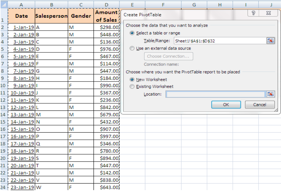 Figure 1. Create pivot table
Here we’ll use pivot table to calculate the amounts of sales and to analyze the performance of males and females separately.
- Go to “Insert” and click “Pivot Tables” in the “Tables” section of ribbon.
- A window in the example above will appear with already selected range. Then choose the worksheet option to place the table.
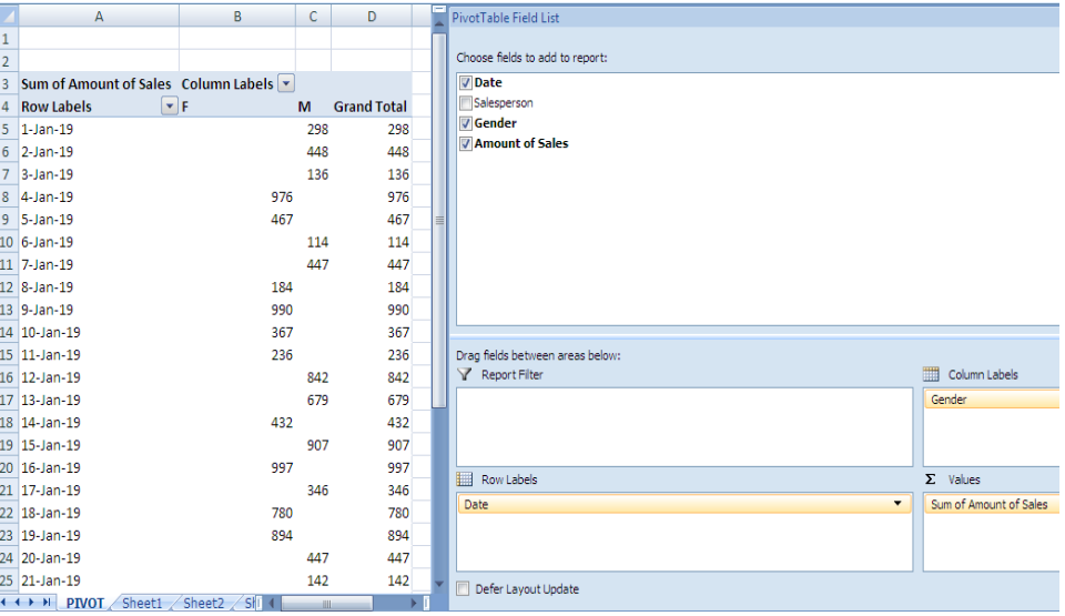 Figure 2. Choose fields to add to report
- We can now see a table with a list of fields.
- The field with the values that we want to add up will be placed in the “Values” section.
- Place date in “Row labels” and gender in the “Column labels” to present separate sales of females and males.
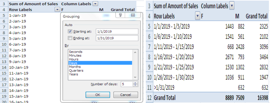 Figure 3. Grouping
- Still the cannot be analyzed properly, so groups of “Row Labels” are made to minimize the scattered data.
- Make a right click on cell A5 and click on “Group” and we can see a grouping window.
- Groups of 5 days are made. We can also make a group of 8 or 10 days whatever is the need.
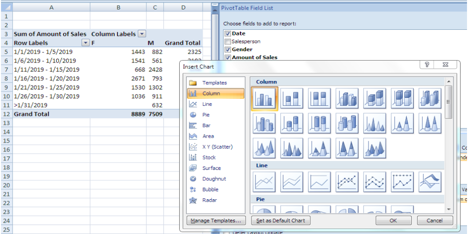 Figure 4. Create visual presentation of data
Grouping has made the data to be analyzed in an easy way.
- Click on options above ribbon, and click “Pivot Charts” in “Tools” section to create a visual presentation of data.
- We can select the chart of our choice and see the data visually in the picture given below.
Pivot Table Presentation 1
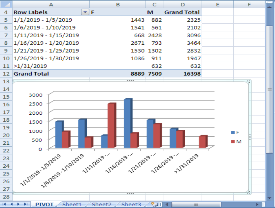 Figure 5. Pivot Table Presentation 1
Sales of Males are represented with red and blue is for the sales by Females and days of sales are mentioned below the chart.
Pivot Table Presentation 2
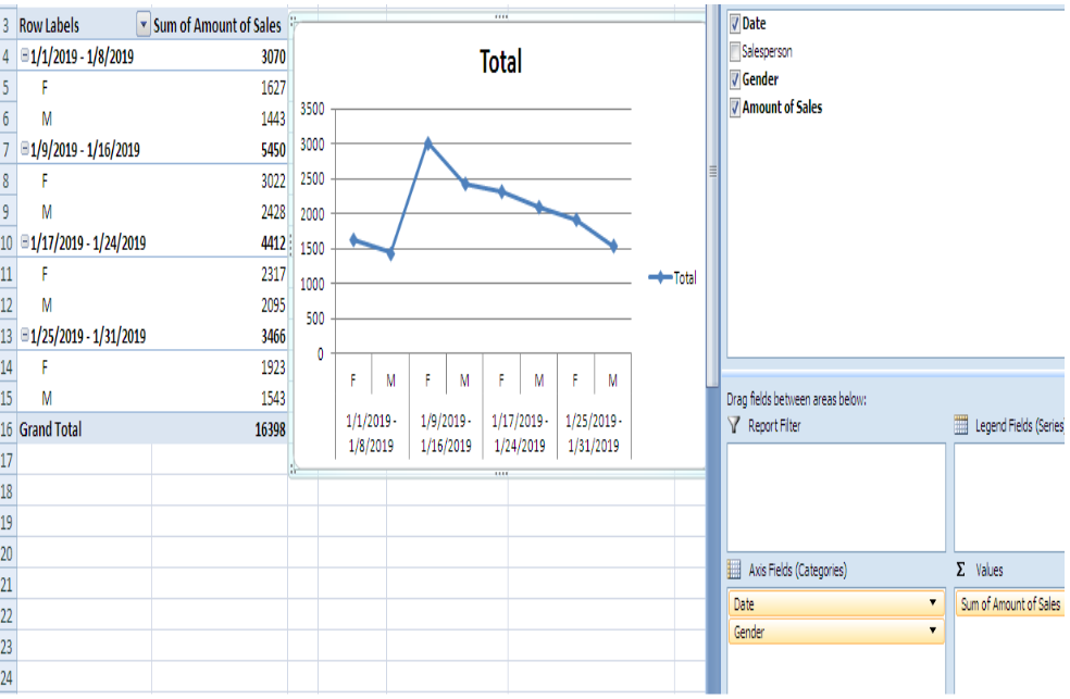 Figure 6. Pivot Table Presentation 2
This is another way to create a pivot table for the same data by keeping two fields in the “Row Labels” section.
And the chart selected here is also different from the previous one.
Pivot Table Presentation 3
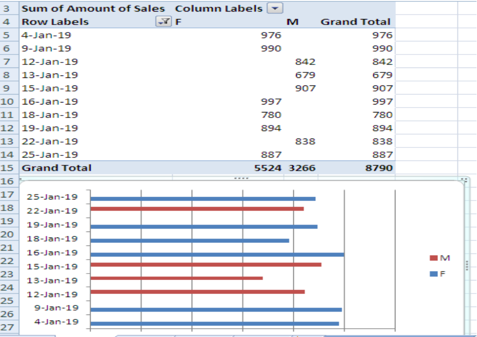 Figure 7. Pivot Table Presentation 3
In this figure, the table and the chart is formed based on the top 10 employees with the highest sales taken from the data before grouping.
- Click the arrow in the “Row Labels” heading, click “value filters” and select “Top 10” to get top 10 sales.
- Pivot table along chart in this example is based on 10 employees only.
Notes
The value filters has other options also like “Less than”,”Greater than”, “Equals” etc.
Date filters could be applied too and Column Labels has also an option of filters.
We can show or hide field list and headers through this section
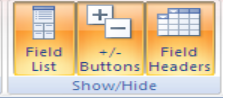
Figure 8. Show.hide field list and headers
in options category above ribbon.
Most of the time, the problem you will need to solve will be more complex than a simple application of a formula or function. If you want to save hours of research and frustration, try our live Excelchat service! Our Excel Experts are available 24/7 to answer any Excel question you may have. We guarantee a connection within 30 seconds and a customized solution within 20 minutes.


Leave a Comment