

We use the Pareto graph or sorted histogram to determine our most important factors and their mode of frequency. In this tutorial, we will learn how to create a Pareto Chart in different versions of Excel, carry out Pareto Analysis in Excel and make Pareto chart online.
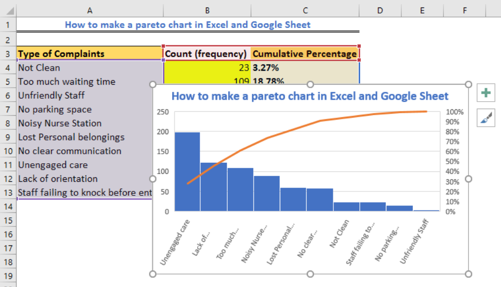 Figure 1 – Excel Pareto Chart
Using the Pareto Chart Generator in Excel and Google Sheets
The Pareto chart generator is different in every version of Excel. For the 2016 version, the Pareto graphical tool is quickly assessed and implemented without problems. When we wish to use an Excel model lesser than Excel 2016, we will have more work to do as displayed in this article.
How to create a Pareto chart in excel 2016
The Pareto chart in excel 2016 is easy to use because it is a built-in function. All we need is our list of items, factors, categories on one column and their frequency on another column. We can have a data set displayed in figure 2.
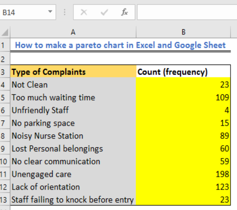 Figure 2 – Setting data for Pareto chart on excel
- Next, we make our Pareto graph by selecting our table
- At the top of the Excel sheet, we go to the Insert Tab, navigate to the Charts group and tap, Recommended Charts
 Figure 3 – How to create Pareto chart
- Next, we go to the All Charts Tab and click on Histogram in the left pane and select the Pareto thumbnail.
- Click OK
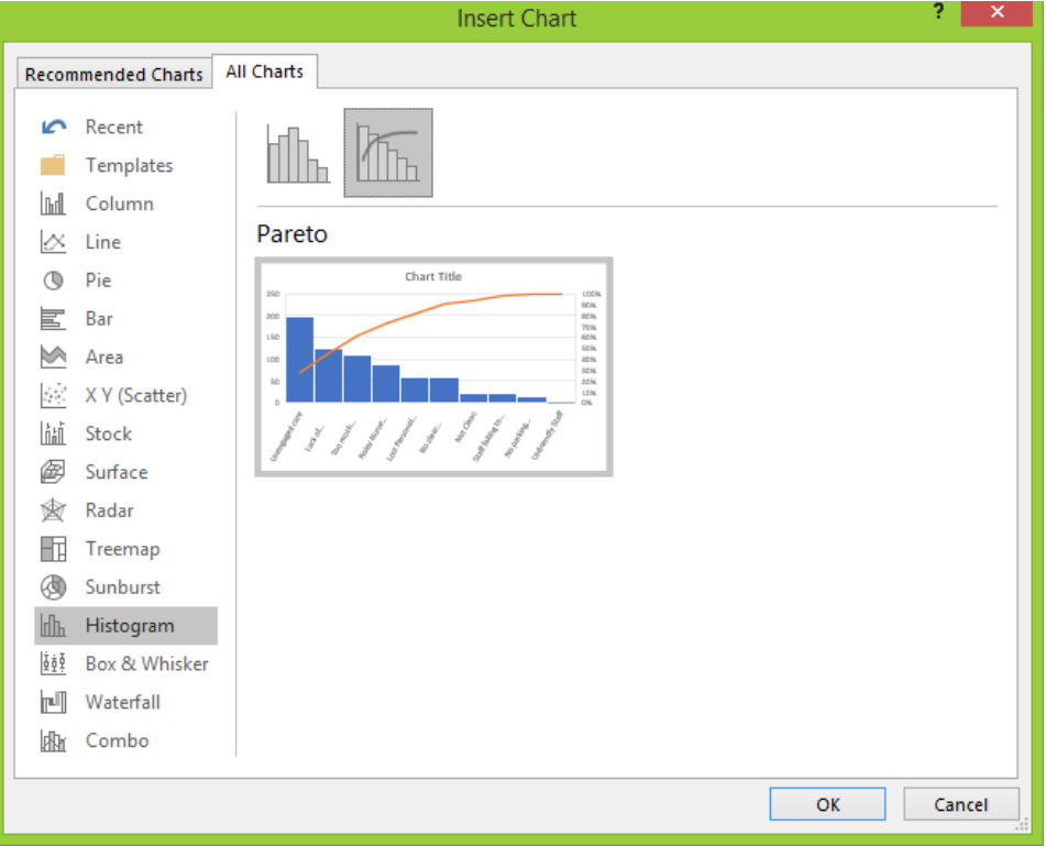 Figure 4 – How to make a Pareto chart in excel
Customizing a Pareto graph in Excel
After creating our Pareto chart in Excel 2016, we can change the style, color, and many other things to suit our wishes.
Designing the Pareto chart
We will click anywhere on the Pareto chart to see the Chart Tools tab appear on the ribbon. We can switch to the Design tab to glance through the different chart colors and styles.
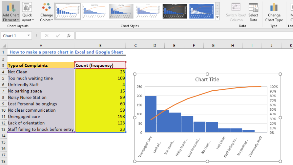 Figure 5 – Pareto graph in Excel
Hide or show data labels
By default, our Pareto graph in Excel has no data labels. We can add data labels by:
- Click on Chart Elements button, select the Data labels box and choose where we want to place labels in the drop-down menu.
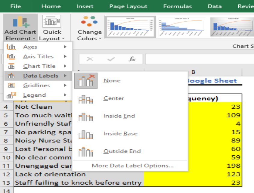 Figure 6 – Formatting Pareto graph in excel
- Next, we hide the primary vertical axis, by clicking again on the Chart Elements button, tap the little arrow next to Axes and unmark the Primary Vertical Axis box.
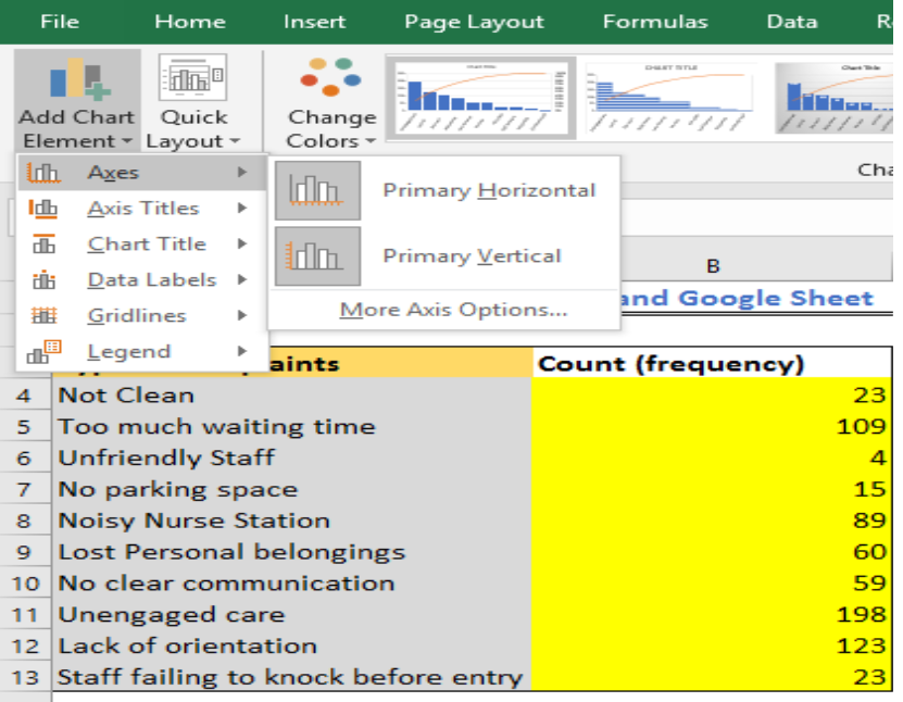 Figure 7 – Pareto chart Excel 2016
Making a Pareto chart in Excel 2013
In Excel 2013, we do not have all those great automatic manipulations like the Pareto chart in Excel 2016 edition. We will have to carry out plenty of functions manually using the following milestones.
Shaping data for Pareto analysis
First, we need to shape our data by using the following steps:
Calculate the cumulative percentage of total
We will add a column to our data set and enter the formula below. Then, we will use the fill handle tool to copy the formula down the column.
=SUM($B$4:B4)/SUM($B$4:$B$13)
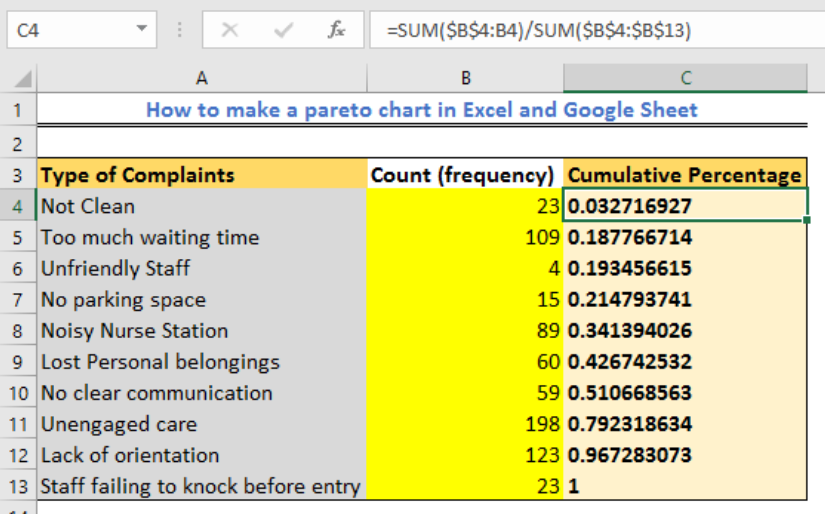 Figure 8 – Pareto analysis in Excel
Next, we will highlight the Column, navigate the Home tab, and click the Number group. In this tray, we will click “Percent Style” to display our decimal fractions results as percentages.
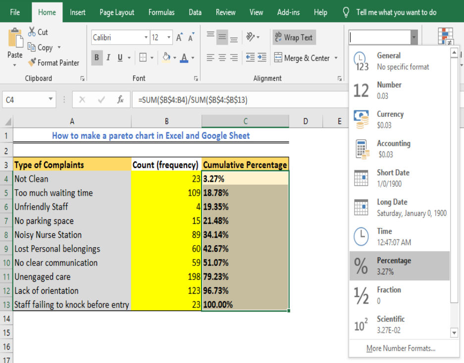 Figure 9 – How to create Pareto
Sort by Count in descending order
We plot bars in the Pareto chart in descending order, by selecting any cell, we will tap the Data Tab. Next, we will select the Sort and Filter group and mark to sort by values in descending order.
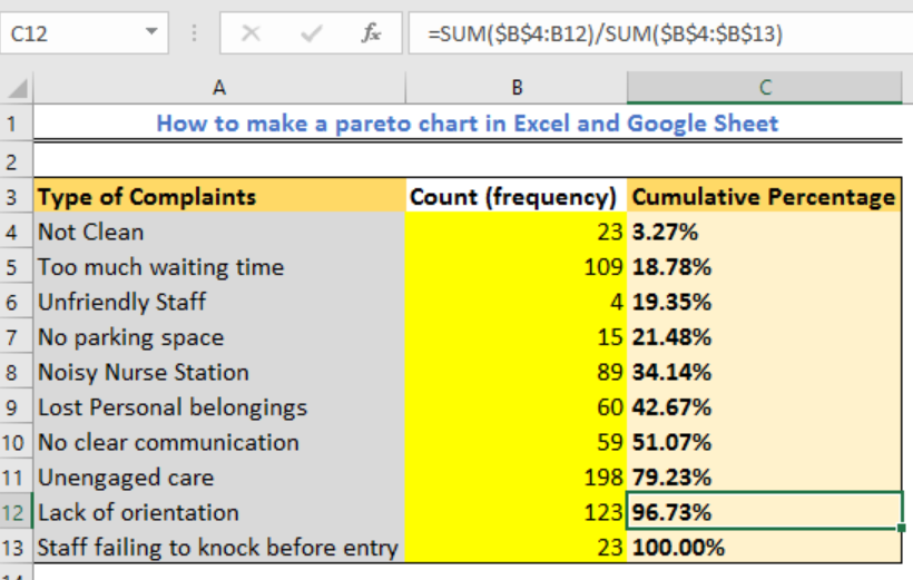 Figure 10 – Pareto excel 2010
Drawing a Pareto chart
After shaping our data, we can now draw our Pareto chart with ease by following these steps:
- We will select any cell or place in the table
- In the Insert Tab, we go to Charts group and select Recommended Charts
- Next, we will select the All Charts Tab and select Combo on the left side.
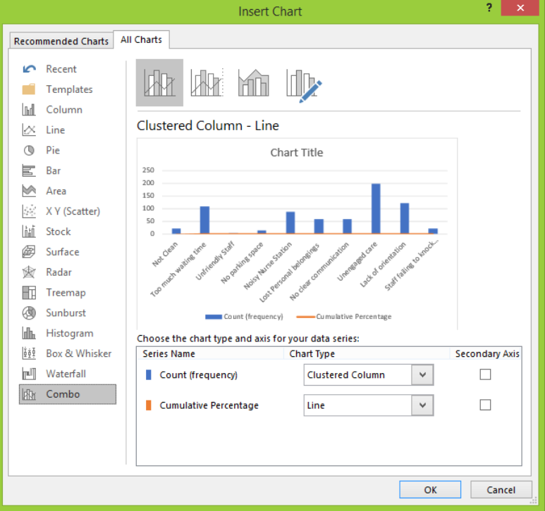 Figure 11 – Making a Pareto chart by hand
- Under the count series, we will tap clustered column
- In the Cumulative series section, we will select Line Type and mark the Secondary Axis box.
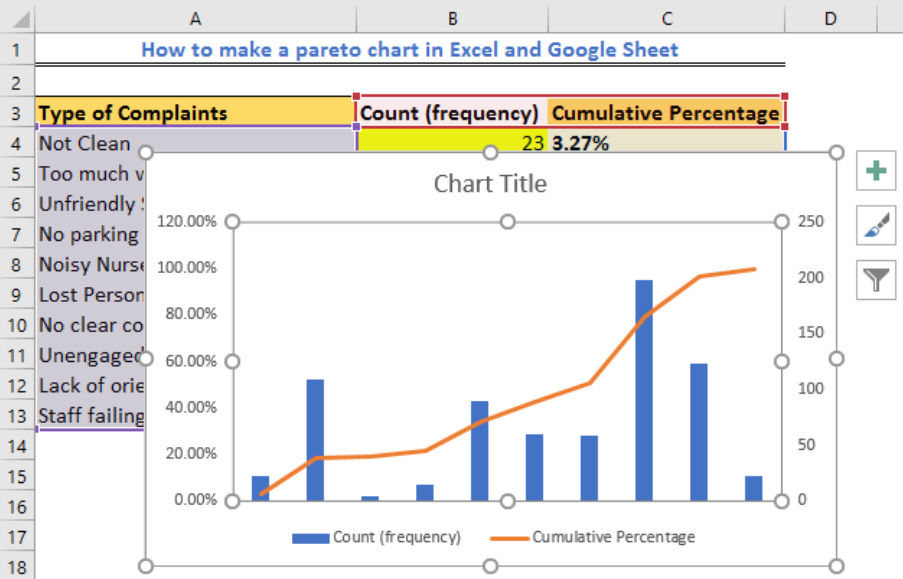 Figure 12 – Pareto chart Example
Adjusting the Pareto chart
Although we now have a Pareto diagram, we may wish to adjust a few things such as:
Setting the maximum percentage value
By default, the secondary vertical axis is set to 120%. If we wish to set it to 100%, we can right click on the Y-axis (right hand) and choose Format Axis. In this pane, we find Bounds and in the Maximum box, enter 1.0.
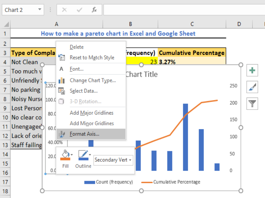 Figure 13 – Formatting Pareto chart in excel
Remove extra spacing between bars
To make bars plotted closer to each other, we right click on the bars and select Format Data Series, then set the desired Gap Width.
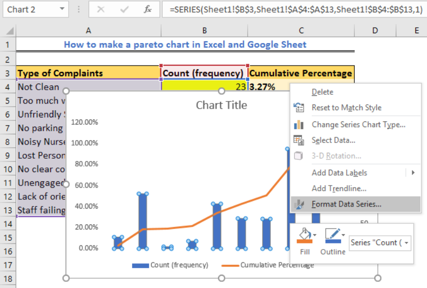 Figure 14 – Creating a Pareto chart
How to create a Pareto chart in Excel 2010
We do not have the Pareto or Combo chart type in Excel 2010. In its stead, we have more manipulations before we can get the Pareto chart. Here are the steps we will take.
Shaping our data
Our first step is to sort our data by count in descending order and evaluate the cumulative total percentage by using the formula below.
=SUM($B$2:B2)/SUM($B$2:$B$11)
- Next, we tap the Data Tab, select the Sort and Filter group and mark to sort by values in descending order.
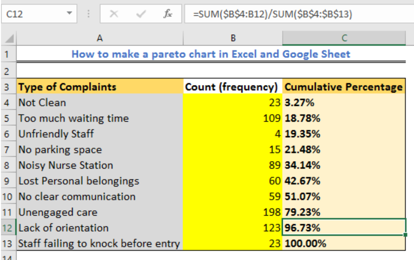 Figure 15 – Setting up data for Pareto chart
Drawing the Pareto chart
Now, we will select the table, go to the Insert Tab and find 2-D Clustered Column Chart type under the Charts group.
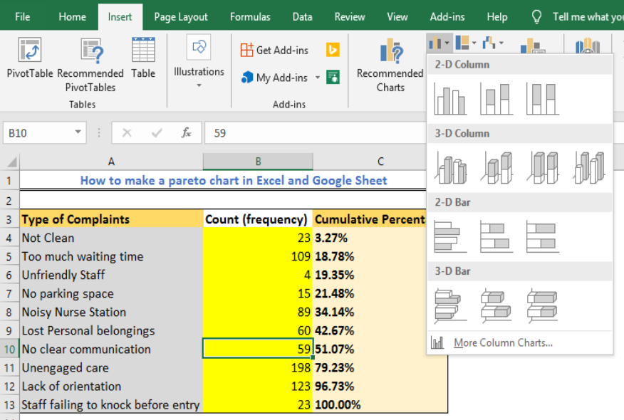 Figure 16 – A 2D clustered column for making Pareto chart in excel
- We will insert a chart with 2 series of data (count and cumulative percentage)
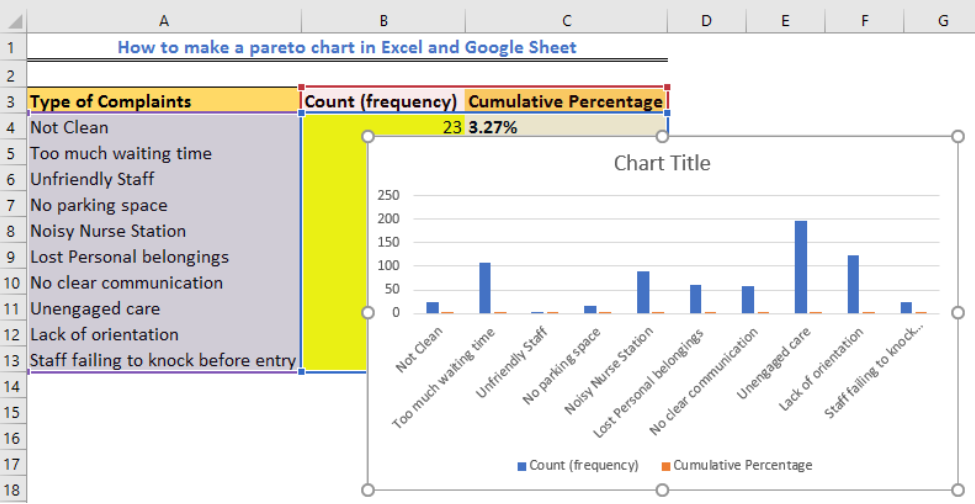 Figure 17 – Making Pareto by hand in Excel 2010
- We will right-click on the cumulative % bars and select Change Chart Series Type.
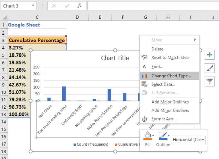 Figure 18 – Making Pareto Chart in Excel 2010
- In the Change Chart Type dialog box, select a Line
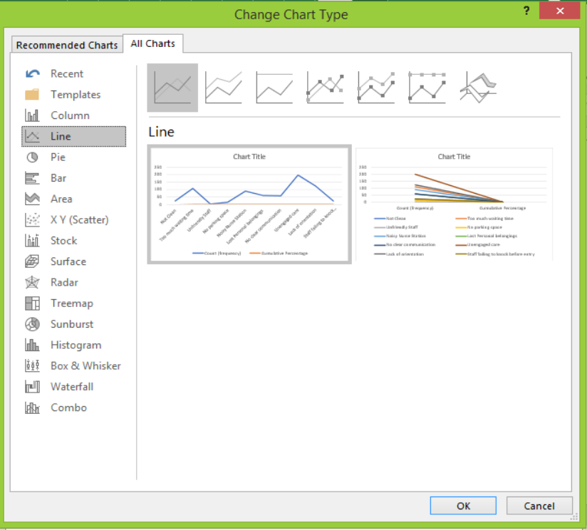 Figure 19 – Line graph insertion for Pareto chart
- Now, we will right-click the cumulative % line and then select Format Data Series
- In the Format Series Dialog box, we will select Series Options and choose Secondary Axis, then close the dialog box.
- Next, we can set the maximum value by following the steps described in the Pareto Chart for Excel 2013.
Note
- Performing the Pareto Analysis in Excel
The Excel Pareto chart or diagram is based on the Pareto principle. It was named after Alfred Pareto the economist and is sometimes called the 80/20 rule. It works by stating that major events (80%) are caused by smaller causes (20%).
- Using the Pareto Chart Generator
When we plot the Pareto diagram, it looks like a sorted histogram with vertical bars and a horizontal line cutting across. The line represents our cumulative total percentage while the bars represent the frequency of values.
Instant Connection to an Excel Expert
Most of the time, the problem you will need to solve will be more complex than a simple application of a formula or function. If you want to save hours of research and frustration, try our live Excelchat service! Our Excel Experts are available 24/7 to answer any Excel question you may have. We guarantee a connection within 30 seconds and a customized solution within 20 minutes.


Leave a Comment