

An organization chart in Excel displays the reporting relationship of a company or other entities using a graphic. Each level in our organizational hierarchy is depicted by a set of boxes.
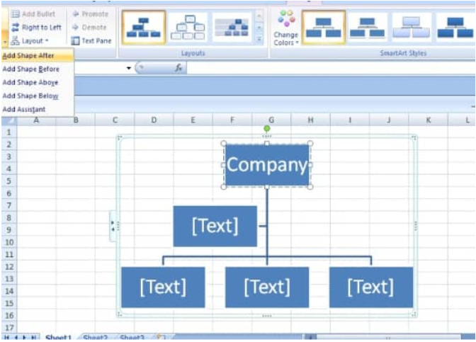 Figure 1. Organizational Chart in Excel
If we want to make an illustration of the management structure in our company, family tree or organization, we can generate a SmartArt graphic which uses a hierarchy layout, to create an organizational chart in Excel.
How to Make an Organizational Chart in Excel
We will now demonstrate how we can use the SmartArt graphic feature to create an org chart from Excel data representing the reporting relationships within an organization with the following simple steps;
- Click on the “Insert” tab of our worksheet and then, under the “Illustrations” group, click on the “SmartArt” button;
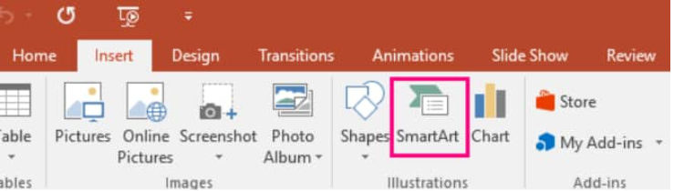 Figure 2. SmartArt Button in Excel
- In the next “Choose a SmartArt Graphic” gallery, click on “Hierarchy”, and then click on any organization chart layout (i.e Organization Chart) > click on “OK”;
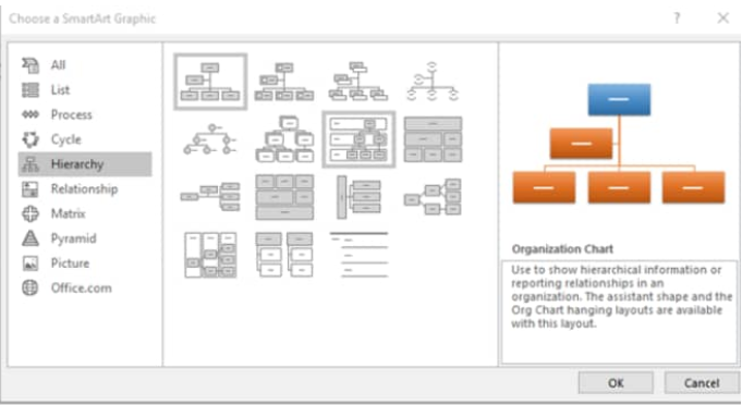 Figure 3. Organizational Chart Layout in Excel
- To input our text, click inside a SmartArt graphic box, and then type out any text;
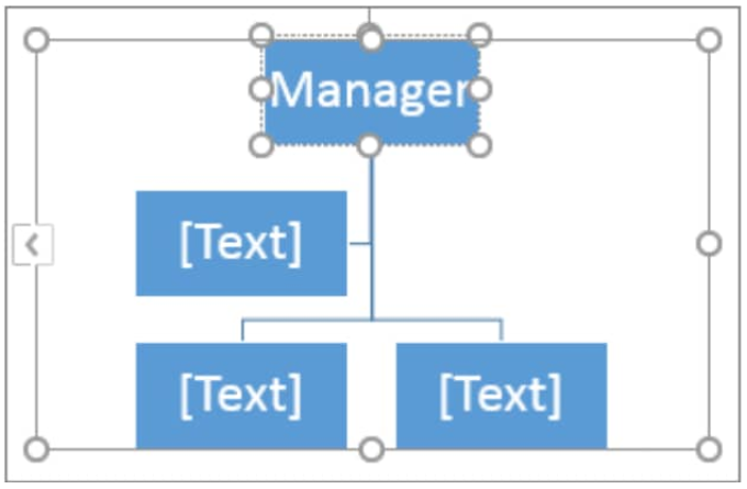 Figure 4. Organizational Chart Text Input Box in Excel
Instant Connection to an Excel Expert
Most of the time, the problem you will need to solve will be more complex than a simple application of a formula or function. If you want to save hours of research and frustration, try our live Excelchat service! Our Excel Experts are available 24/7 to answer any Excel question you may have. We guarantee a connection within 30 seconds and a customized solution within 20 minutes.


Leave a Comment