

Heat map is a graphical representation of data on a color scale. It gives us a comparative view to understand the pattern in the data set. We create a heatmap with conditional formatting using built-in color scale rules.
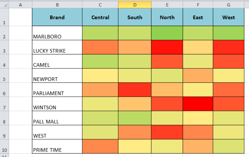 Figure 1. Heat Map
How to Make a Heat Map
Suppose we have a data set of cigarettes band sales in various regions. We want to see the pattern of sales of each cigaret band in different regions on a color scale from minimum to maximum, like minimum with red color scale and maximum with the green color scale.
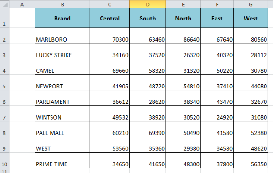 Figure 2. Sales Data Set
Apply Conditional Formatting
Using conditional formatting we can make a heatmap with color scale rules easily. It helps us to visually understand the pattern of cigarettes brands’ sales on selected color scales. We need to apply the following steps to create a heat map with conditional formatting;
- Select the cells’ range C2: G10 of the data set
- On the Home tab, from Style group select the Conditional Formatting.
- Click on Color Scales and select one of the given color scale styles.
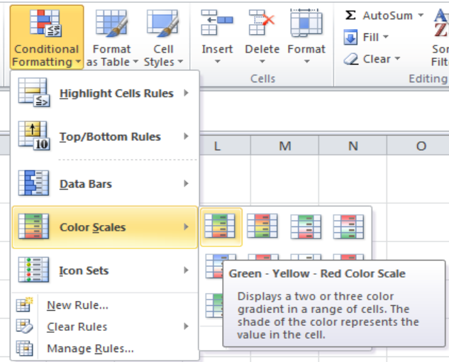 Figure 3. Select Color Scale
- The selected color scale applies to the data set and shade of the color represents the value in the cell. Green color highlights for maximum, yellow for midpoint and red for the minimum point.
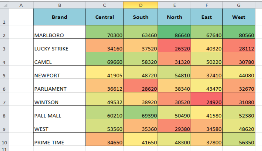 Figure 4. Conditional Formatting Color Scales
Hiding the Numbers
Optionally, we can hide the numbers of the heat map to give us a view of color scales only. We need to do the followings;
- Select the data set again and right-click anywhere in the cells of the data set and select Format Cells.
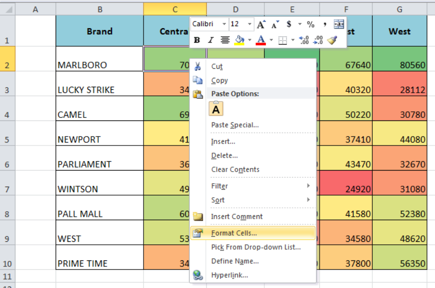 Figure 5. Formatting Cells
- Go to Custom and apply ;;; format type and press OK
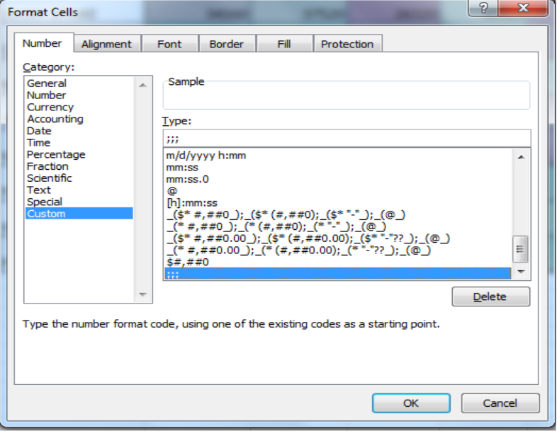 Figure 6. Applying Custom Format Type
This format hides all the number of data set from heat map and Excel displays only the color scale representing the values from highest to lowest.
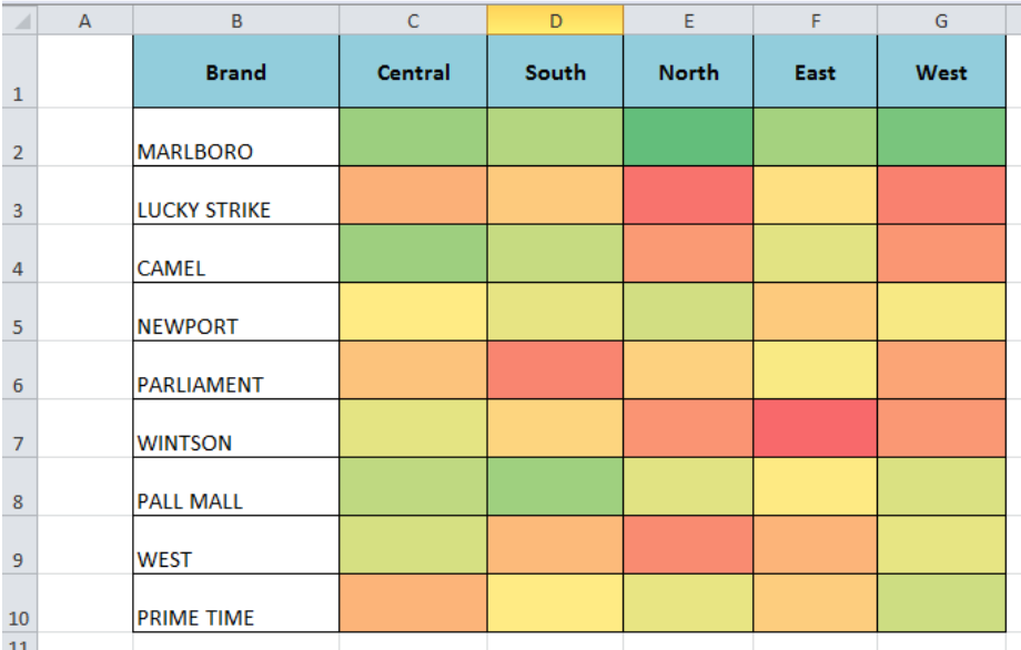 Figure 7. How to Make a Heat Map
Instant Connection to an Expert through our Excelchat Service
Most of the time, the problem you will need to solve will be more complex than a simple application of a formula or function. If you want to save hours of research and frustration, try our live Excelchat service! Our Excel Experts are available 24/7 to answer any Excel question you may have. We guarantee a connection within 30 seconds and a customized solution within 20 minutes.


Leave a Comment