

Excel allows us to simply structure our data.according to the content and purpose of the presentation. When we want to compare actual values versus a target value, we might need to add a line to a bar chart or draw a line on an existing Excel graph.
This step by step tutorial will assist all levels of Excel users in the following:
- How to add a horizontal line in an Excel bar graph?
- How to add a horizontal line in an Excel scatter plot?
- How to add a target line in Excel?
Suppose we have below data and we insert a column chart using the data in B2:C7.
- Select B2:C7
- Click Insert tab, Other Charts, then All Chart Types
- Select Column, then Clustered Column
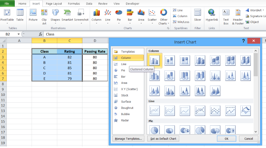 Figure 1. Insert a column chart
A column chart will be created, showing the rating per corresponding class.
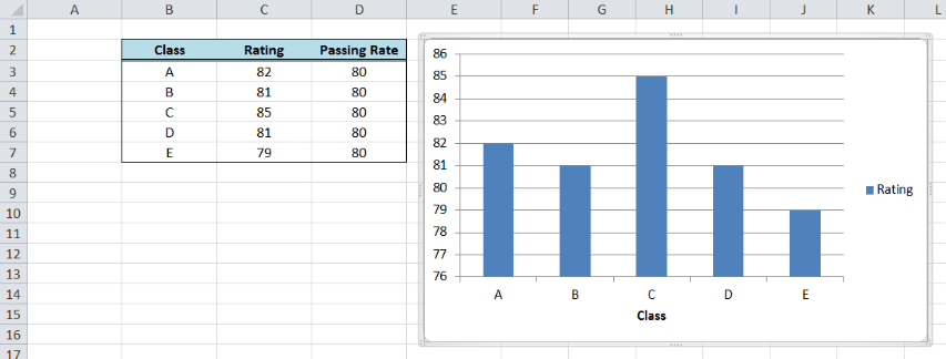 Figure 2. Column chart showing class ratings
How to add a horizontal line in an Excel bar graph?
We want to add a line that represents the target rating of 80 over the bar graph. In order to add a horizontal line in an Excel chart, we follow these steps:
- Right-click anywhere on the existing chart and click Select Data
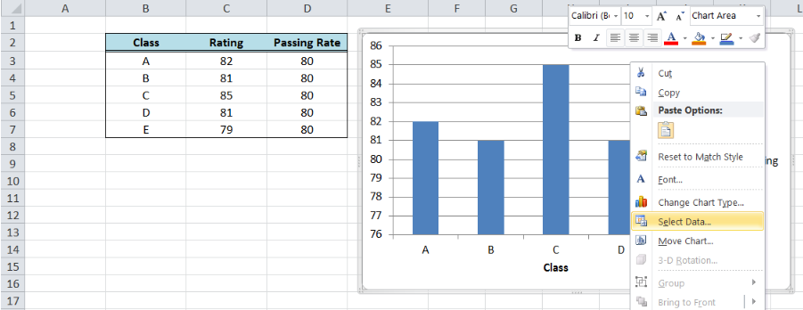 Figure 3. Clicking the Select Data option
- The Select Data Source dialog box will pop-up. Click Add under Legend Entries.
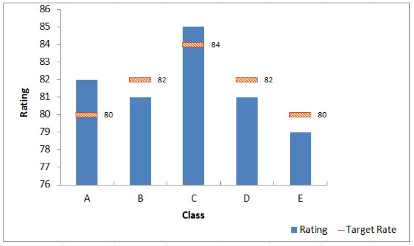 Figure 4. Adding a series data
The Edit Series dialog box will pop-up.
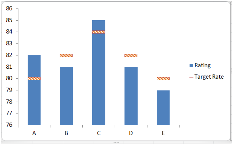 Figure 5. Edit Series preview pane
- In Series name, select cell D2 or “Passing Rate”.
- In Series values, select D3:D7 or input
=column!$D$3:$D$7. Click OK.
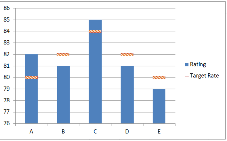 Figure 6. Adding the series name and values
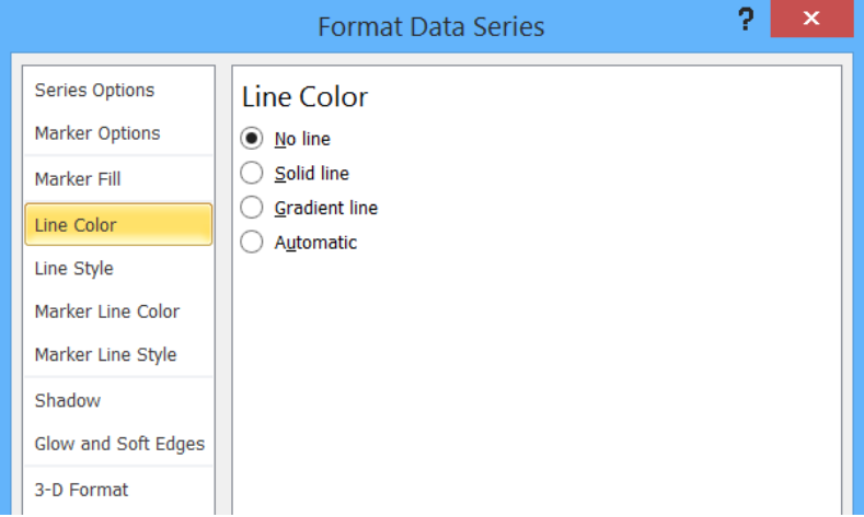 Figure 7. New Series “Passing Rate” added
- Click OK. A second column chart will be displayed beside the first chart.
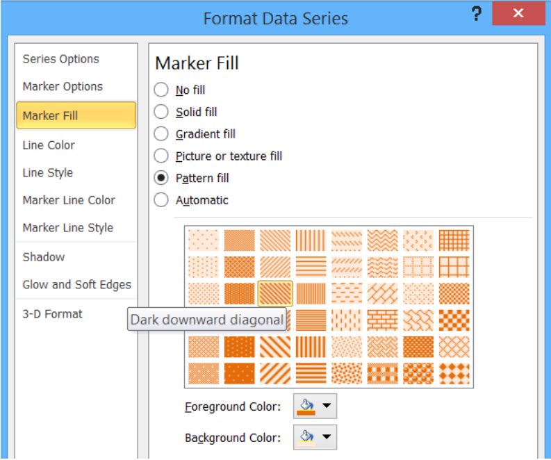 Figure 8. Combination column chart
- Click the second column chart “Passing Rate”, right-click and select “Change Series Chart Type”
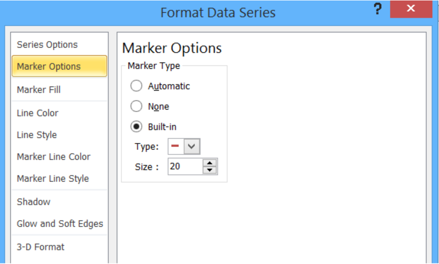 Figure 9. Clicking the Change Series Chart Type
- Select Line and press OK
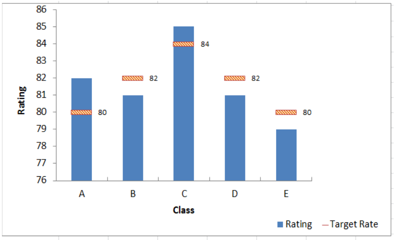 Figure 10. Selecting the Line chart type
The second column chart “Passing Rate” will be changed into a line chart.
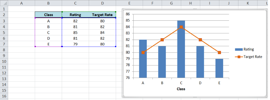 Figure 11. Output: Add a horizontal line to an Excel bar chart
Customize the line graph
Click on the line graph, right-click then select Format Data Series.
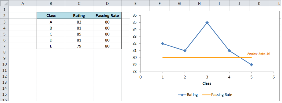 Figure 12. Selecting the Format Data Series
These are some of the ways we can customize the line graph in Excel:
- Change line color
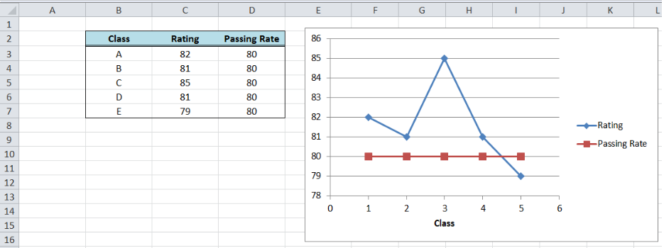 Figure 13. Changing the line color
- Add markers
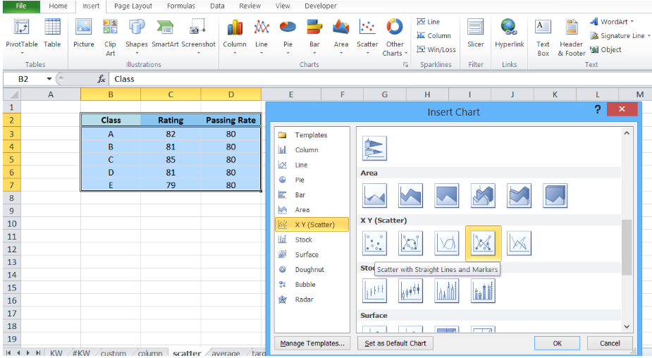 Figure 14. Adding a built-in marker
- Add data label
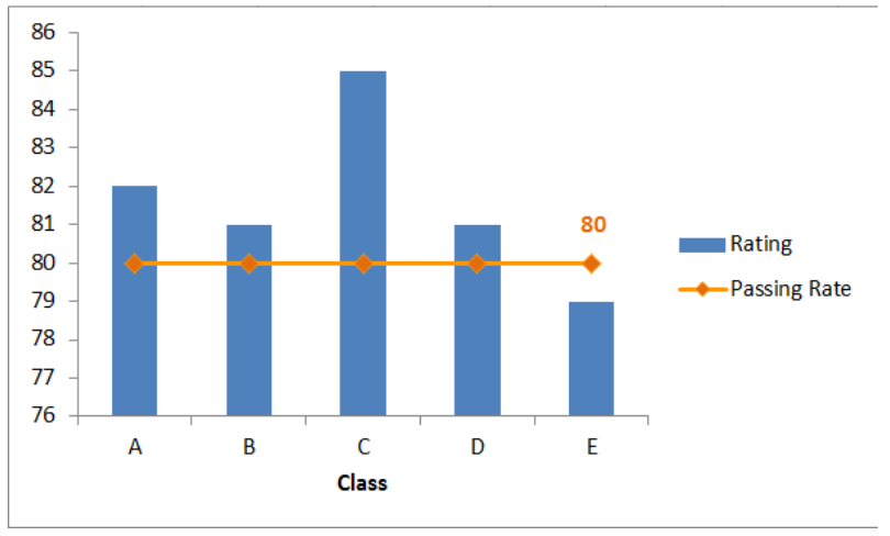 Figure 15. Final output: add a line to a bar chart
How to add a horizontal line in an Excel scatter plot?
We can follow the same procedure discussed above wherein we add a horizontal line to an Excel chart. However, this time let us try a quicker approach where we graph the two data points for Rating and Passing Rate at the same time using an XY Scatter plot.
- Select B2:D7
- Click Insert Chart, and select X Y (Scatter), then Scatter with Straight Lines and Markers.
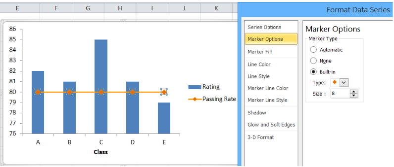 Figure 16. Creating an X Y Scatter Plot
We will be able to combine the two graphs in one chart, where Rating and Passing Rate are both presented in the form of data points connected by lines and markers.
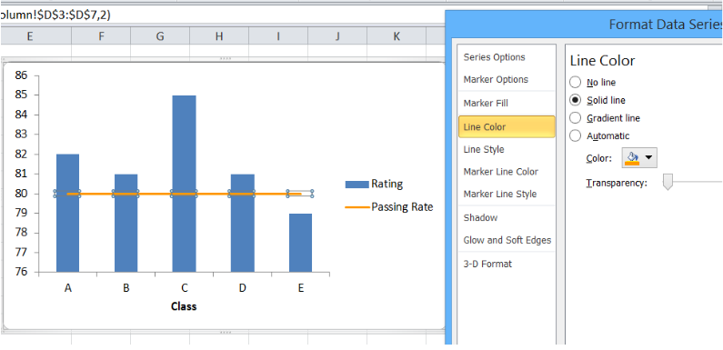 Figure 17. Combination X Y scatter plot
The value for passing rate is constant at 80 and it is presented as a horizontal line. This combination graph makes it easy to compare the rating per class to the passing rate of 80.
We can customize the line graph by changing the line color, removing the markers and adding a data label. We can do any customization we want when we right-click the line graph and select “Format Data Series”.
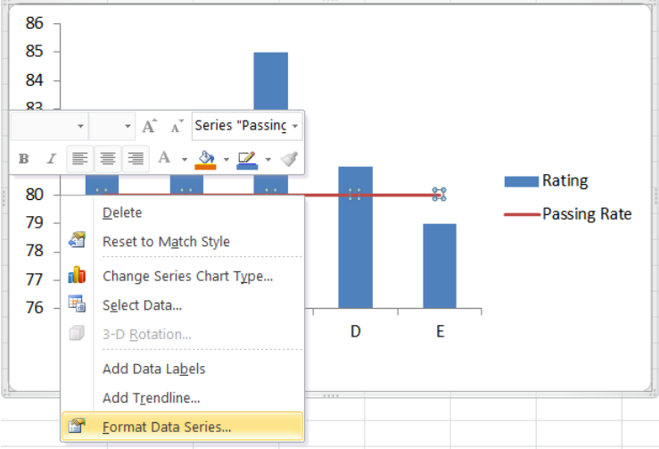 Figure 18. Final output: How to add a horizontal line in an Excel scatter plot
The resulting graph shows that the rating for classes A to D are well above the passing rate of 80.
How to add a target line in Excel?
Target values are not always equal for all data points. Suppose we have different targets for each class as shown below. We follow the same procedure as the above examples in adding a line to a bar chart. The combined line and bar graph will look like this:
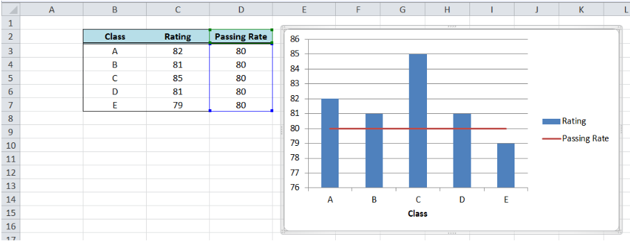 Figure 19. Output: Add line graph to a bar graph
When targets for each class are connected through lines as shown above, the comparison between the actual and target rating is not very clear. There is a more effective way to compare the data that will improve visualization and analysis, like the example below.
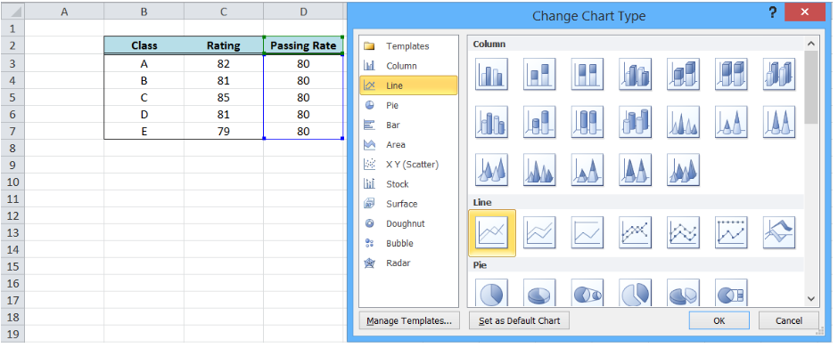 Figure 20. Bar graph with customized target graph
This graph can be done by customizing our target graph through these steps:
- Double click on the Target Rate graph to show the Format Data Series dialog box
- Input the following settings:
- In the Marker Options, select Built-in Marker Type and select the horizontal line or “dash” in the drop-down menu
- Select size 20
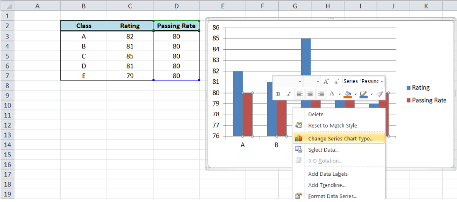 Figure 21. Selecting a built-in marker type and size
-
- Under Marker Fill, select Pattern Fill, “Dark Downward Diagonal”
- Select the Foreground Color Orange, Accent 6, Darker 25%
- Select the Background Color Orange, Accent 6, Lighter 80%
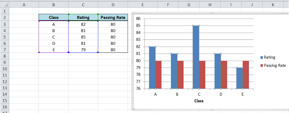 Figure 22. Customizing marker fill settings
-
- Line Color: No Line
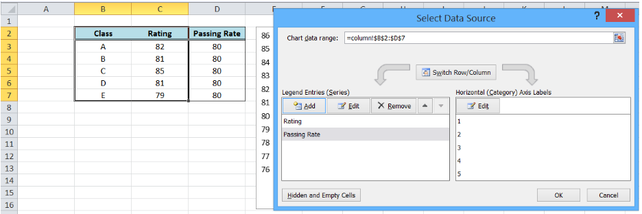 Figure 23. Removing line color for the target graph
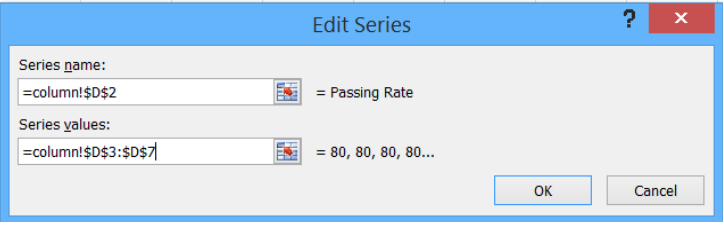 Figure 24. Output graph after initial formatting
- Delete the major gridlines
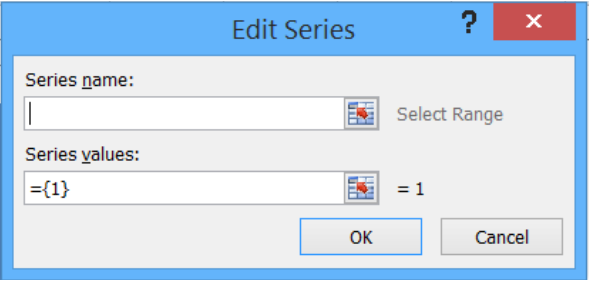 Figure 25. Output graph with deleted major gridlines
- Add data labels and axis titles, and move the legend to below the graph
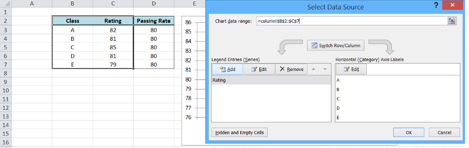 Figure 26. Output: How to add a target line in Excel
Most of the time, the problem you will need to solve will be more complex than a simple application of a formula or function. If you want to save hours of research and frustration, try our live Excelchat service! Our Excel Experts are available 24/7 to answer any Excel question you may have. We guarantee a connection within 30 seconds and a customized solution within 20 minutes.


Leave a Comment