

We can visually represent insights in Excel using a histogram. It organizes a series of data by taking several points among the data and groups them into ranges known as bins. In this tutorial, we will learn how to create a histogram in Excel.
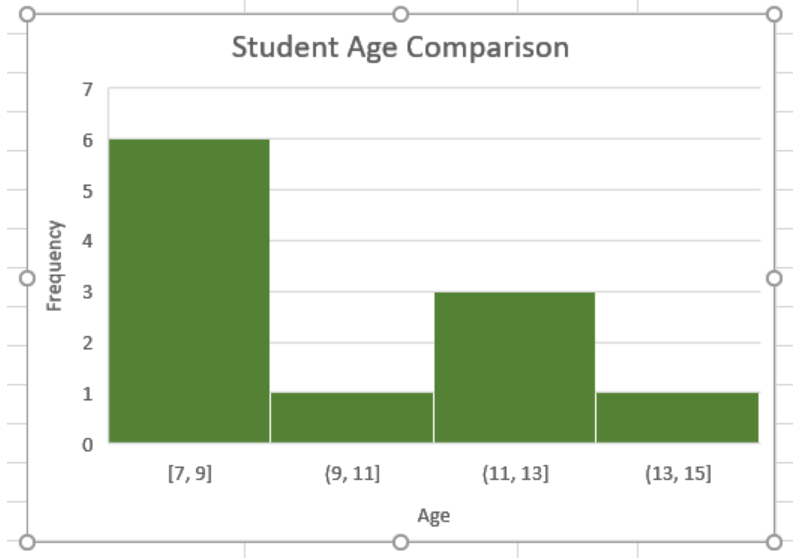 Figure 1. Excel Histogram Chart
We can make histograms in Excel 2016 and later versions using the built-in chart option. For previous versions, we need to use the Data Analysis Toolpakck. To create a histogram in Excel Mac, we need to follow different procedures.
How to Create an Excel Histogram Chart
In this example, we will be using a student information database. Columns A and B have the names and ages respectively.
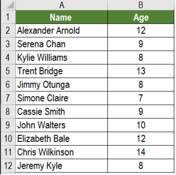 Figure 2. The Sample Student Information Data Set
How to Make a Histogram in Excel 2016
To create a histogram representing the frequency of ages in Excel 2016 and later versions, we need to:
- Go to cell B2. Click on it with your mouse. Drag the selection from cells B2 to B12.
- Go to the Insert tab from the ribbon.
- In the Charts section, we have to click on Insert Statistic Chart.
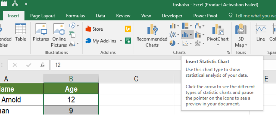 Figure 3. Selecting the Statistic Chart Option
- From here, Select the Histogram icon.
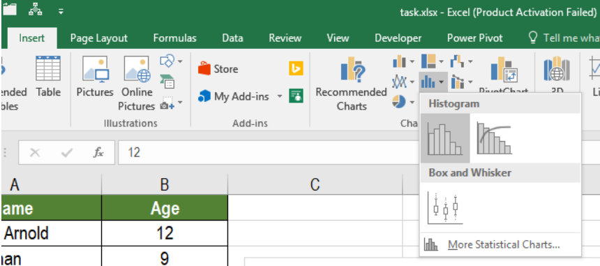 Figure 4. Making Histogram in Excel
This will create a histogram for all the ages.
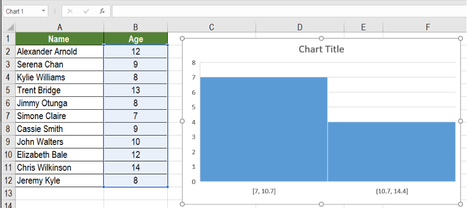 Figure 5. Histogram for the Frequency of Ages
We can make changes to this histogram and cater it to our own requirements. To make the histogram show the frequency of an age group of two years, we need to:
- Right click on the vertical axis and select Format Axis.
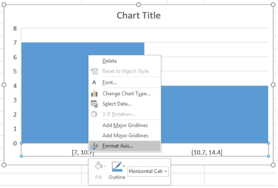 Figure 6. Example of how to Format the Histogram
- Then, we have to click on the Axis Options and set the Bin Width to 2. The bin width specifies how big the bin needs to be.
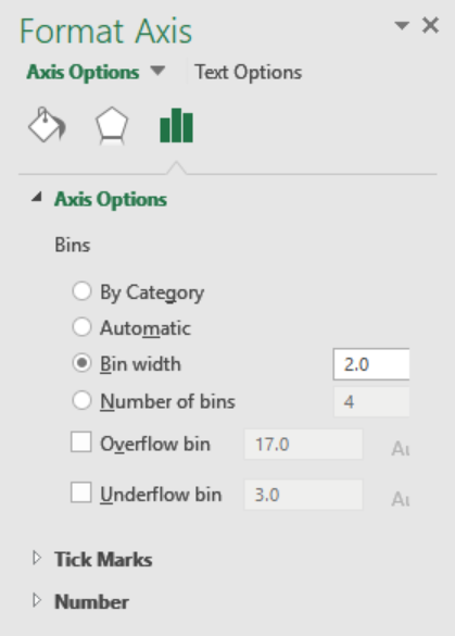 Figure 7. Modifying the Bin Width
This will make the frequency of ages in a group increased by 2 at each iteration.
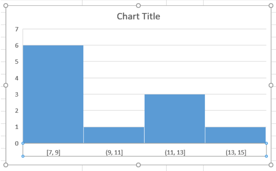 Figure 8. Histogram with a Bin Width of 2
- We can also change the number of bins of a histogram in excel. To make the histogram have 5 bins, we need to go to step 2 and set the Number of Bins to 5. This will show the histogram with 5 bins.
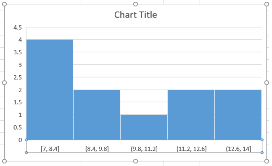 Figure 9. Changing the Number of Bins to 5
- We can also use the Overflow and Underflow Bin options to further modify the histogram. The Overflow Bin clubs together values that are higher than a certain value.
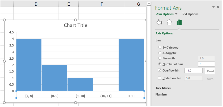 Figure 10. Example of the Overflow Bin Option
The Underflow Bin groups together values that are lower than a certain value.
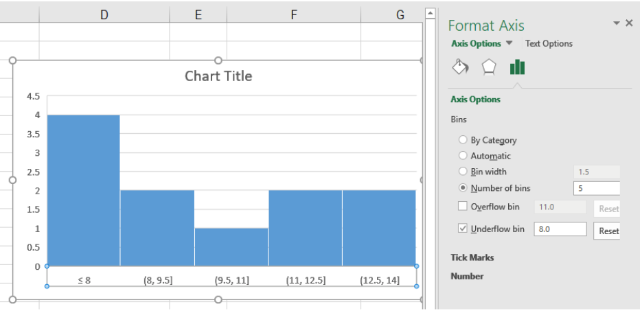 Figure 11. Example of the Underflow Bin Option
- We can also customize the looks of the histogram. This can be done by changing the title, gridlines, colors, etc. from the Format Axis option.
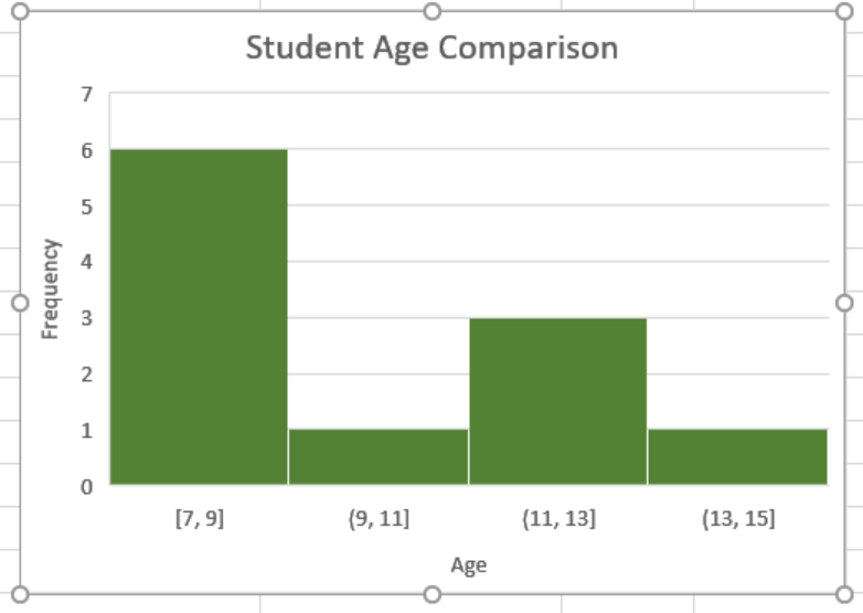 Figure 12. Example of Modifying the Looks of the Histogram
Creating a Histogram Using Data Analysis Toolpak
For versions prior to Excel 2016, we have to use the Data Analysis Toolpakto create a histogram. First, we need to install the Data Analysis Toolpak. It allows us to create a histogram using the data as inputs. To do that,
- We need to Click the File tab in the ribbon.
- Select Options.
- From the Excel Options box, we need to click Add-ins from the navigation pane.
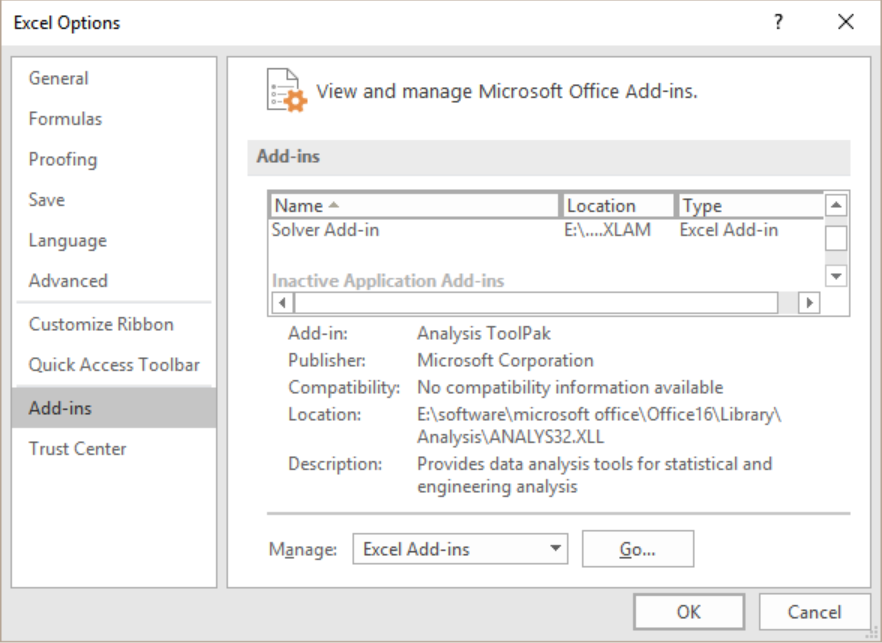 Figure 13. The Excel Options Box
- Now, the Manage drop-down will pop up.
- We need to click on the Excel Add-ins.
- Click Go.
- Next, we need to select the Analysis Toolpak from the Add-ins box and click OK.
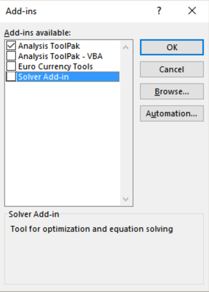 Figure 14. Installing the Data Analysis Toolpak
This will install the Analysis Toolpak. We need to access it from the Data tab in the Analysis group.
To create the previous frequency histogram in Excel using the Data Analysis Toolpak:
- We need to create a bin range. To do that we need to group the ages by two years in cells C2:C5.
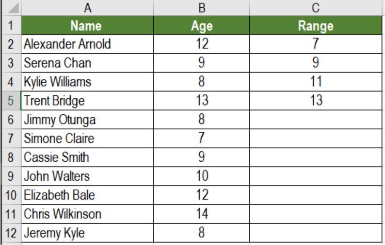 Figure 15. Setting the Ranges
- Next, we need to go to the Data tab on the ribbon.
- From the Analyze group, we need to select Data Analysis.
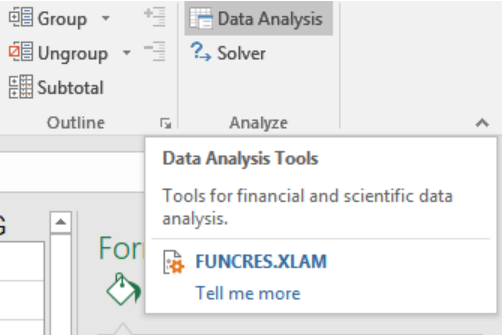 Figure 16. The Data Analysis Option on the Ribbon
- From the Data Analysis dialog box, click on Histogram.
 Figure 17. Creating a HIstogram with the Data Analysis Toolpak
- Click OK.
- Next, From the Histogram dialog box, we need to select the Input Range and Bin Range (cells B2:B12).
- Keep the Labels box unchecked (We need to check it if we had labels in the data).
- Lastly, we need to specify the Output Range to have the Histogram in the same worksheet. Otherwise, we can select the New Worksheet/Workbook option.
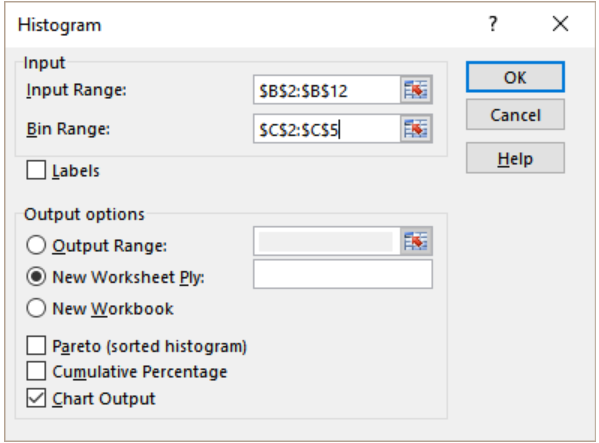 Figure 18. Setting the Parameters for the Histogram
- Select Chart Output.
- Click OK.
This would insert the histogram with the frequency distribution in the specified location.
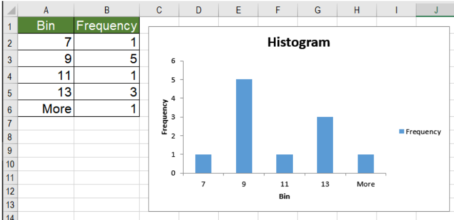 Figure 19. The Resulting Histogram using the Data Analysis Toolpak
How to Make a Histogram in Excel Mac
To create the histogram from the previous example in Mac, we need to:
- Click on the Insert tab in the ribbon.
- Then, we have to click the Statistical Icon Graph.
- Select the Histogram option.
- Now we need to click anywhere in the histogram chart and add it to the design format of the ribbon. This will show us the chart design options. From there, we can modify the histogram in Excel Mac.
Creating a Histogram in Google Sheets
We can create a histogram in Google sheets by calculating the normal distribution. To create the histogram from the previous example, we need to:
- Go to cell B2. Click on it with your mouse. Drag the selection from cells B2 to B12.
- Click on Insert > Chart. This will generate a line chart with the data.
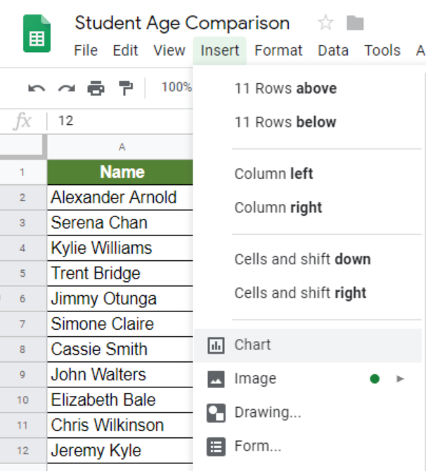
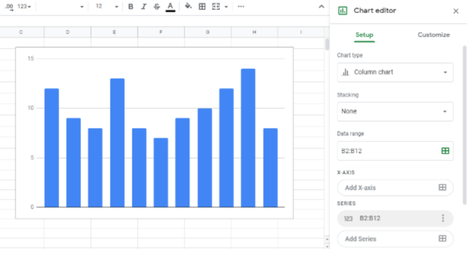 Figure 20. Example of how to Insert a Chart in Google Sheets
- Now, from the Chart Editor on the right go to Chart Type. Scroll down to the Other section and select Histogram chart.
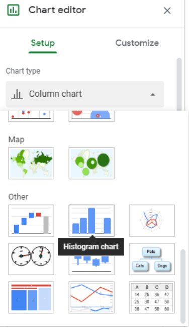 Figure 21. The Chart Editor Option
We can customize the bin sizes. To do that, we need to go to the Customize tab from the Chart Editor. Here, we can change the Bucket Size to 2.
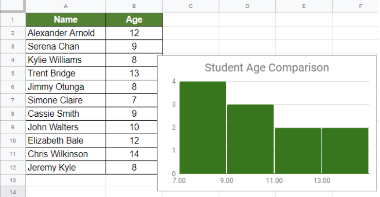 Figure 22. Example of How to Create a Histogram in Google Sheets
This will create the same histogram as before in Google Sheets.
Most of the time, the problem you will need to solve will be more complex than a simple application of a formula or function. If you want to save hours of research and frustration, try our live Excelchat service! Our Excel Experts are available 24/7 to answer any Excel question you may have. We guarantee a connection within 30 seconds and a customized solution within 20 minutes.


Leave a Comment