

When we have a set of data and we want to determine the relationship between the variables through regression analysis, we can create a curve that best fits our data points. Fortunately, Excel allows us to fit a curve and come up with an equation that represents the best fit curve.
 Figure 1. Final result: Curve fitting
How to fit a curve
In order to fit a curve to our data, we follow these steps:
- Select the data for our graph, B2:C17, which is a tabular result of the relationship between temperature and volume.
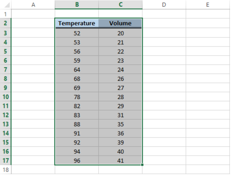 Figure 2. Sample data for curve fitting
- Click Insert tab > Scatter button > Scatter chart
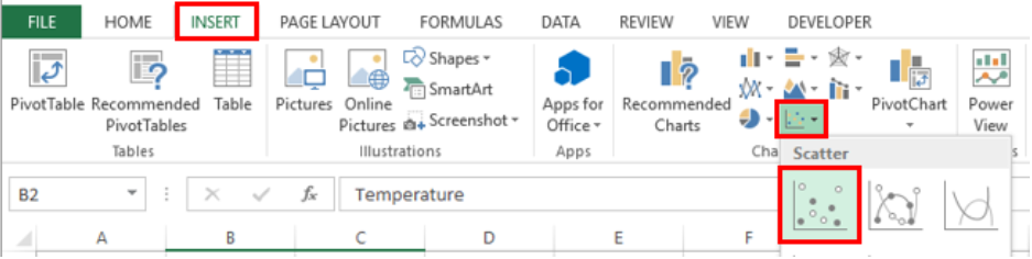 Figure 3. Scatter chart option
- A Scatter plot will be created, and the Design tab will appear in the toolbar under Chart Tools.
- Click Add Chart Element > Trendline > More Trendline Options
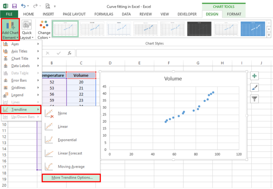 Figure 4. Add Trendline options
- In the Format Trendline window, select Polynomial and set the Order to “2”
- Check the option for “Display Equation on chart”.
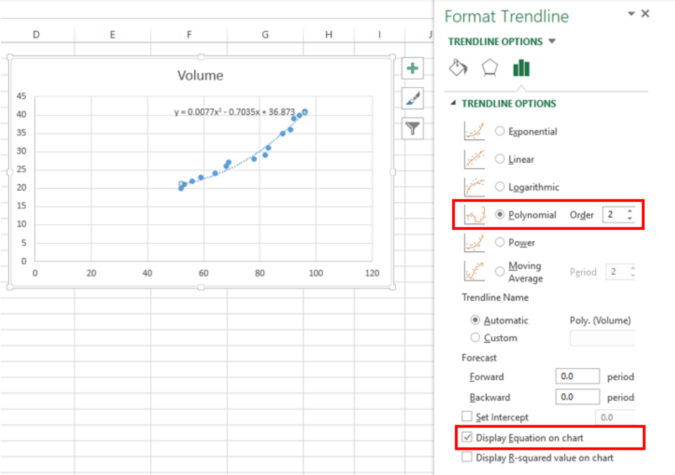 Figure 5. Format Trendline dialog box
Excel will instantly add the best fit curve for our data, and display the polynomial equation on the chart. We can add the R-squared value as a measure of how close our data points are to the regression line. We simply have to check the option for “Display R-squared value on chart”.
In curve fitting, we want the R-squared value to be as close to the value of 1 as possible. The image below shows our scatter plot with a polynomial trendline to the order of 2. The R-squared value is “0.9759”.
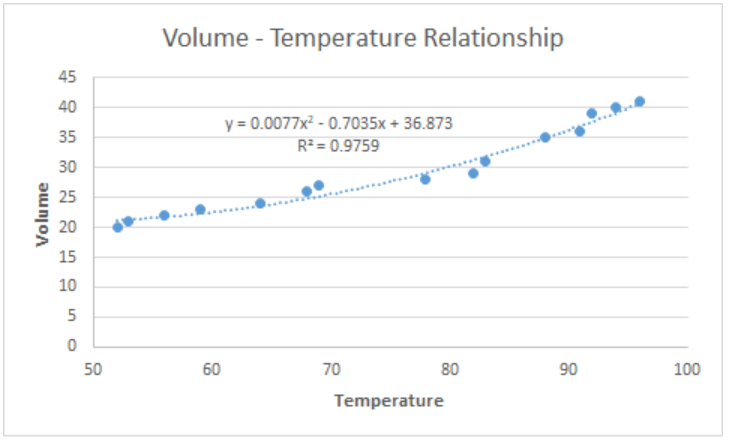 Figure 6. Output: How to fit a curve
Customize the best fit curve
We can further customize our chart by adding axis titles, adjusting the minimum axis values and highlighting the best fit curve by changing the color.
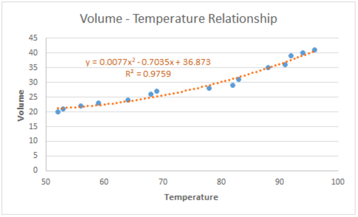 Figure 7. Output: Customize best fit curve
Note:
We can opt to add a linear trendline instead, but a linear curve fit is not the best fit for our data. As shown below, several data points fall far from the linear trendline.
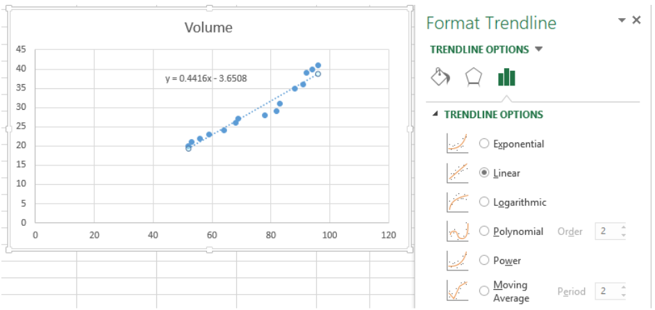 Figure 8. Linear curve fit
Instant Connection to an Excel Expert
Most of the time, the problem you will need to solve will be more complex than a simple application of a formula or function. If you want to save hours of research and frustration, try our live Excelchat service! Our Excel Experts are available 24/7 to answer any Excel question you may have. We guarantee a connection within 30 seconds and a customized solution within 20 minutes.


Leave a Comment