

The Bubble chart is the best choice to graphically visualize three data sets and the show relationship between them. The bubble graph visualizes three dimensions of data, therefore always consists of three data sets, X-axis data series, Y-axis data series, and the bubble size data series to determine the size of the bubble marker.
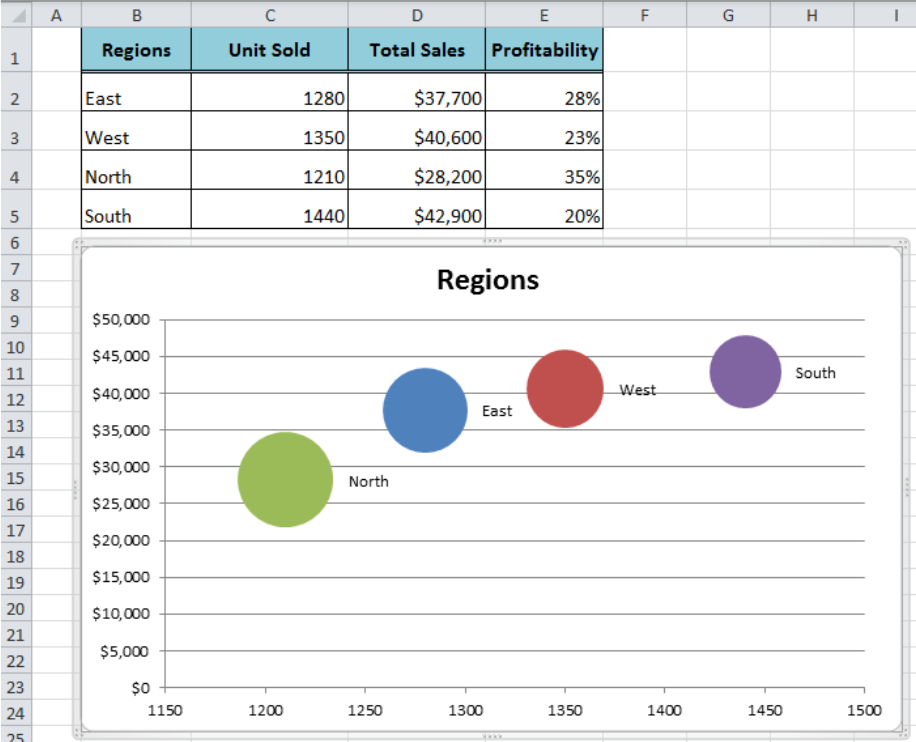 Figure 1. Bubble Chart
How to Make a Bubble Chart
To make a bubble chart we need to have a data set with three data series to plot on X-axis, Y-axis, and bubble size data series. In our example, we have a data set of four regions for units sold, total sales and profitability percentage in each region. We can visualize these three data series of regions on the bubble chart to compare and show the relationship between these three values of the dataset. Follow these point to make the bubble chart;
- Select the data of all three data series.
- Go to the Insert tab > Click on Other Charts and select Bubble Chart.
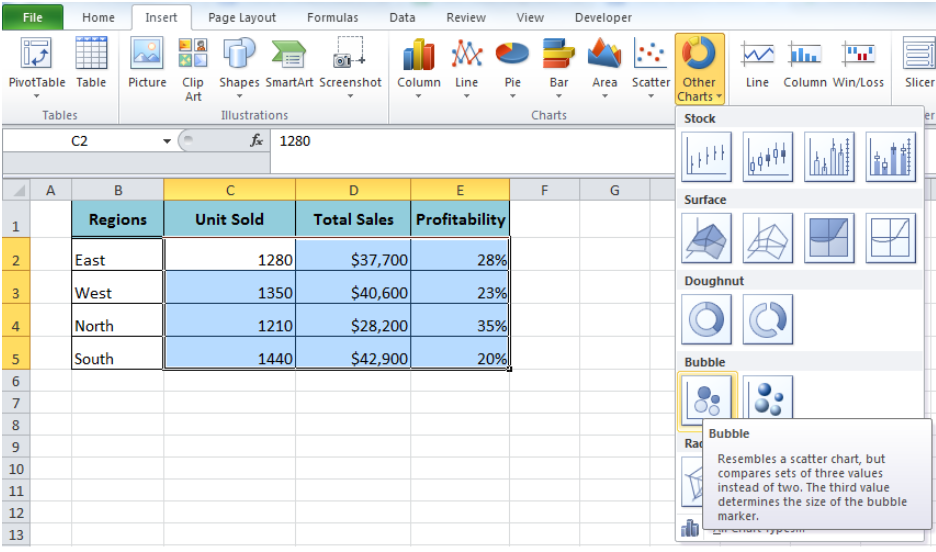 Figure 2. Bubble Charts
- Right-click inside the chart area and click on the Select data option.
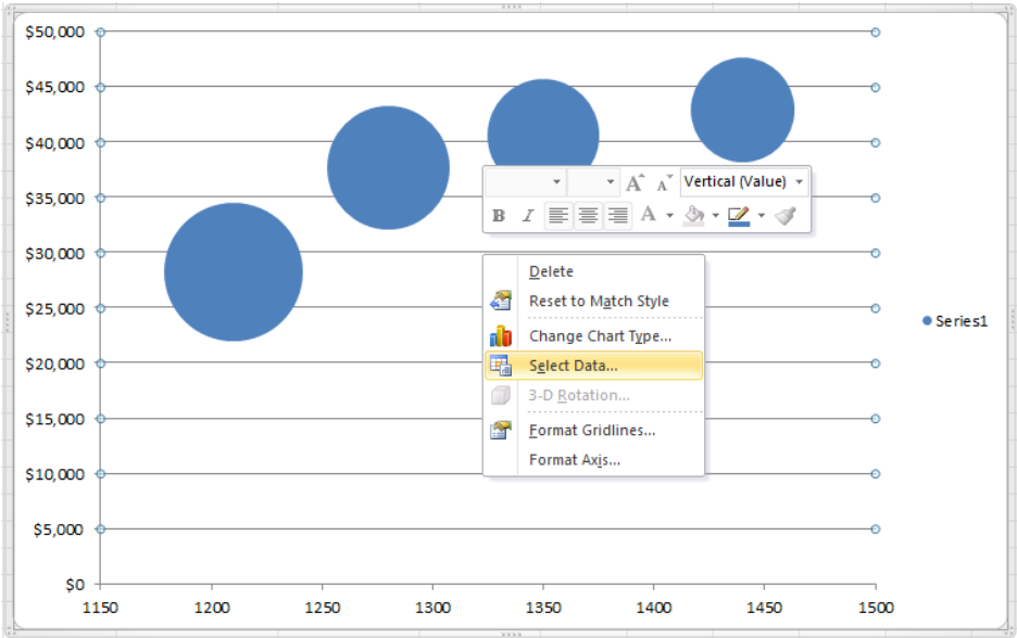 Figure 3. Click on Select Data Option
- On the Select Data Source dialog, click on the Edit button.
 Figure 4. Select Data Source Dialog
- Edit Series dialog box opens to enter the Data series Name.
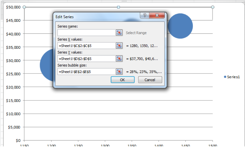 Figure 5. Edit Series Dialog Box
- Click on Serie Name range box and select the Regions cell reference
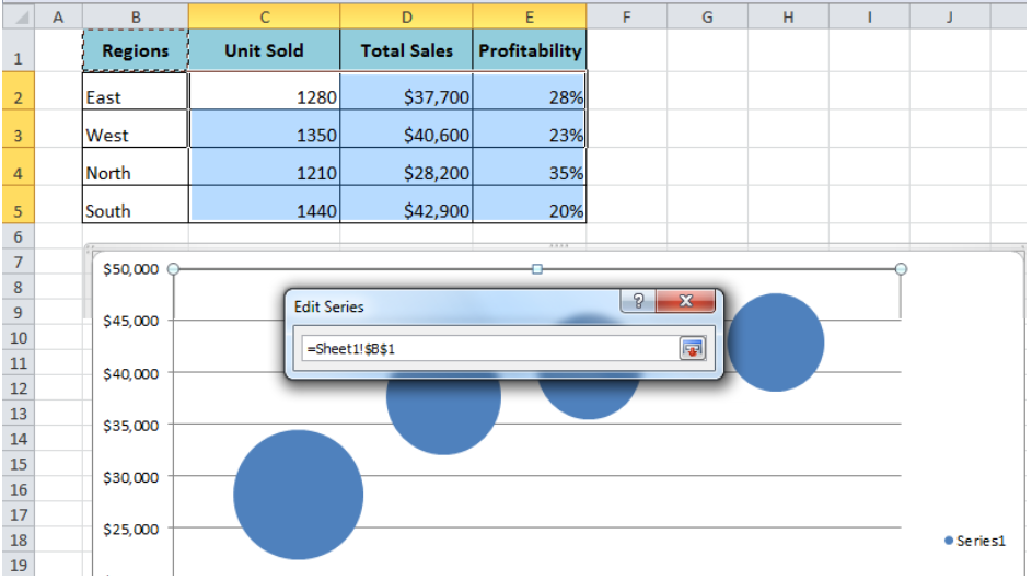 Figure 6. Edit Series Range Box
- Again click on range box to enter the series name and press the OK button > OK button.
 Figure 7. Entering Series Name
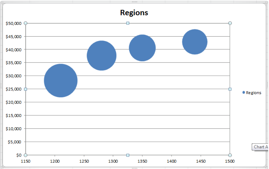 Figure 8. Create the Bubble Chart
- Optionally, change the color of each data series by formatting the data series. Right-click on any bubble marker and select Format data series option.
 Figure 9. Formatting Data Series
- Click on the Fill option, select the “Vary colors by point” and press Close button.
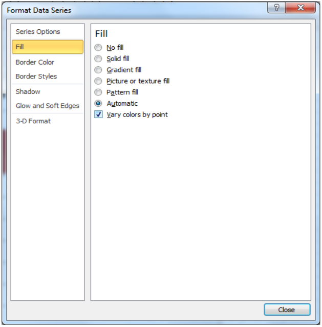 Figure 10. Fill Colors Of Data Series
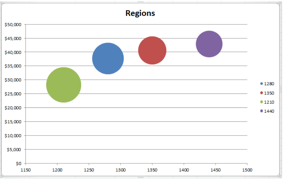 Figure 11. Varying Colors By Data Points
- Again right-click on any of the bubble markers to add data labels. We can enter the name of each region manually with respect to data points.
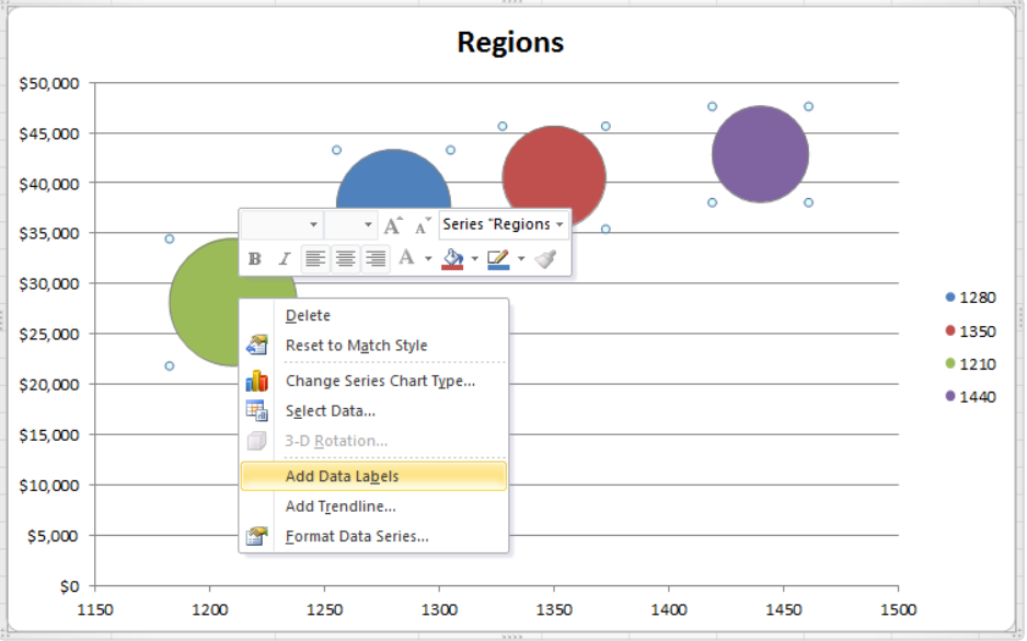 Figure 12. Adding Data Labels
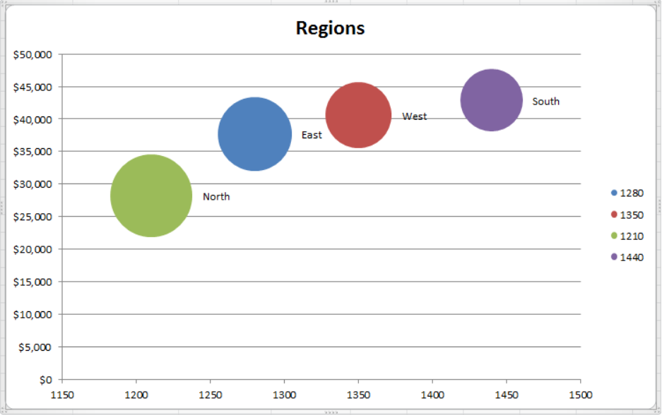 Figure 13. Bubble Graph
Instant Connection to an Expert through our Excelchat Service
Most of the time, the problem you will need to solve will be more complex than a simple application of a formula or function. If you want to save hours of research and frustration, try our live Excelchat service! Our Excel Experts are available 24/7 to answer any Excel question you may have. We guarantee a connection within 30 seconds and a customized solution within 20 minutes.


Leave a Comment