

While analyzing data we summarise the data to present the finding report to our target audience and visualization of data using charts or graphs is the best way to represent it than numbers only. Google Sheets offers a number of charts to visualize our data and we need to learn how to create a graph in google sheets.
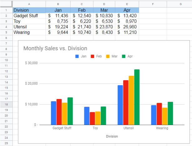 Figure 1. Make a Chart on Google Sheets
How to Make a Chart in Google Sheets
Google Sheets charts are a user-friendly way of data visualization. Suppose we have summarized monthly sales of various divisions of a company. We want to visually present the summarized data for a better understanding of users by creating charts in Google Sheets in the following steps.
- First, we need to go to Google Drive homepage end click on New button on the left of the page.
 Figure 2. Homepage of Google Drive
- Select the Google Sheets to open a blank spreadsheet
 Figure 3. Open Google Sheets
- Enter the monthly sales data in a table range.
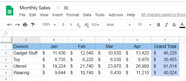 Figure 4. Entering Data in a Table Range
- Select the data range and go to Insert tab and select the Chart from the list. In our example, we select data range A1: E5 to insert chart for.
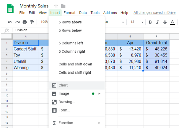 Figure 5. Inserting Google Sheets Chart
- Google Sheets generates one of the suggested charts as per the data with Chart Editor on the right side of the Google spreadsheet.
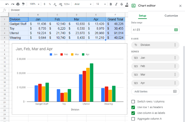 Figure 6. How to Make a Chart in Google Sheets
How to Change Chart Type in Google Sheets
We can easily change chart type in Google Sheets by selecting one of the suggested or other chart types in the list as described below;
- We can opt for the other suggested charts by clicking on Chart type drop-down list on the Setup tab of the Chart editor.
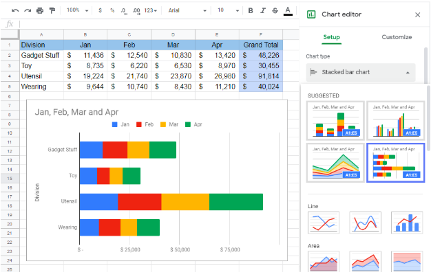 Figure 7. Selecting Suggested Chart Type
- We can also insert the other chart types by selecting from the Chart type list. For example, we can choose the Smooth Line Chart type.
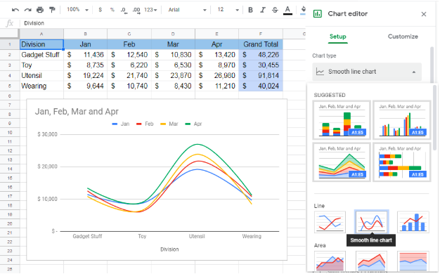 Figure 8. Changing Chart Type
- We can switch the rows and columns for the selected chart type to take effect on the visual by selecting Switch rows/columns option.
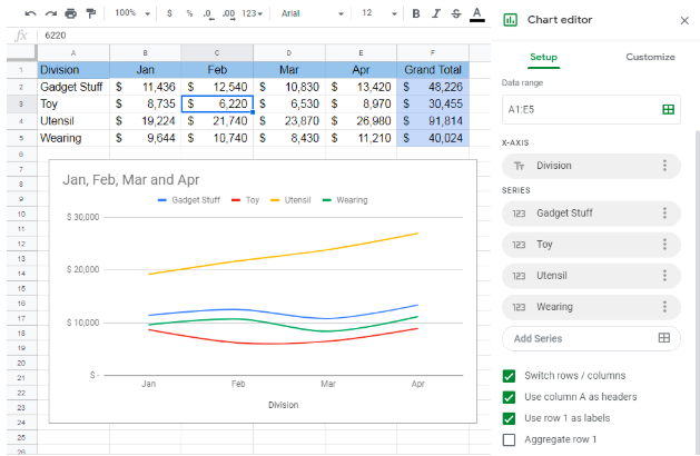 Figure 9. Switching Rows and Columns
How to Add a Series in Google Sheets Chart
We can easily add, edit or remove a series of Google Sheets chart by clicking inside the chart area and launching Chart editor as given below;
- To add a series, just click inside the Add Series box from the Chart Editor and select the data range of required series and press OK button.
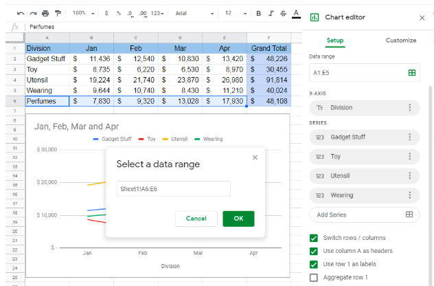 Figure 10. Adding a Data Series
- To edit or remove a data series, we need to click on the settings button in front of the required series and choose the desired option to edit or remove.
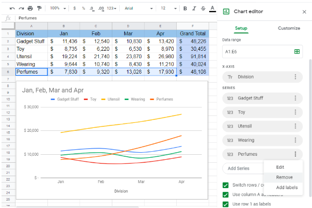 Figure 11. Edit or Remove a Series
How to Edit Google Sheets Chart
After learning how to make a chart in Google Sheets now we need to learn how to edit a chart in Google Sheets with customized options for chart styles, chart and axis titles, font and color, series formats and data labels, etc. To do that click anywhere in the chart area to launch Chart editor and select the Customize tab to edit Google Sheets chart.
- To edit background color and chart font, click on Chart style and make the changes.
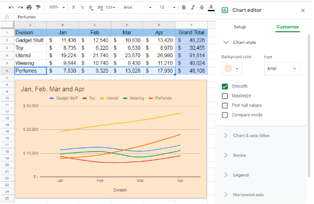 Figure 12. Editing Chart Style
- We can change chart and axis titles by entering the title with customized font, color, size and formatting style from Chart & axis titles menu. Select the Chart or Axis from the list to edit its title and choose the formatting options to apply.
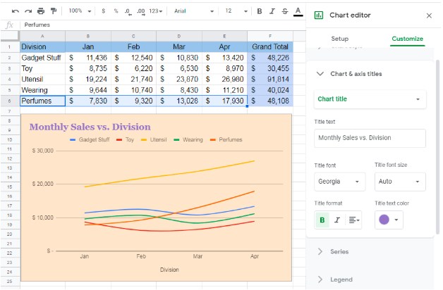 Figure 13. Editing Chart Titles
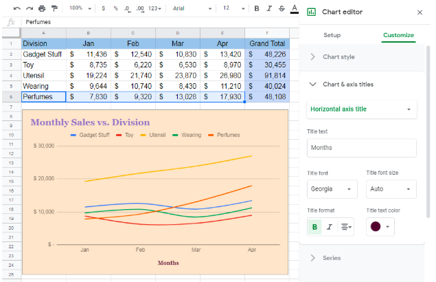 Figure 14. Editing Chart Axis Titles
- We can edit and apply the customized formats to all or selected data series from the Series option.
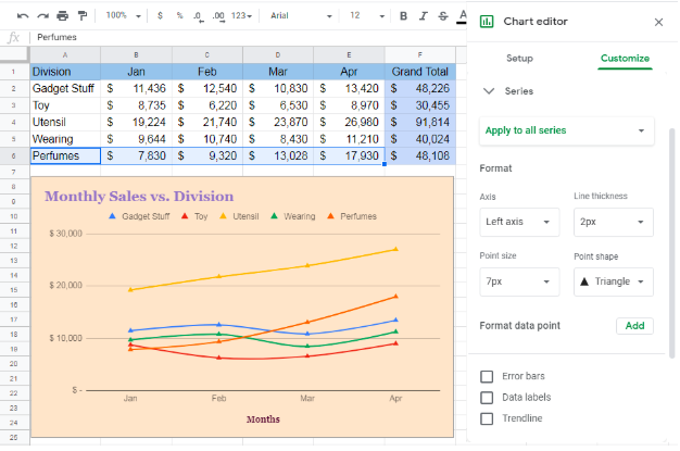 Figure 15. Editing Data Series Formats
- Likewise, we can change the position and formats for the legends, horizontal and vertical axis to be fit for chart visual.
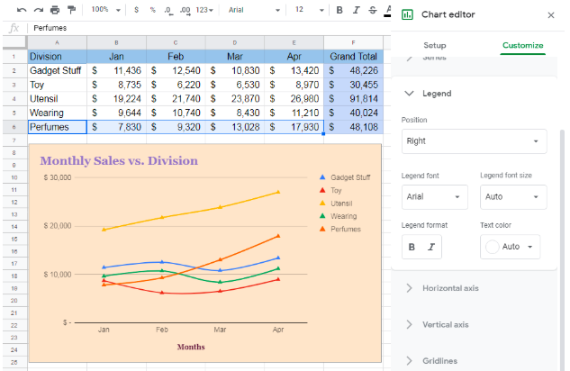 Figure 16. Editing Chart Legends
How to Make a Pie Chart in Google Sheets
The Pie chart gives the overall picture of each value’s contribution in total value. Pie chart uses one data series to display its values as a slice to a pie. Like, we can display the contribution of each division sales to total sales for the given months in our example in the following steps;
- Select the one data series and its range of values. For example, select divisions and Grand Total by pressing Ctrl key.
- Click on Insert tab and select Chart from the list.
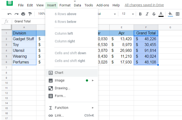 Figure 17. Inserting Pie Chart in Google Sheets
- Select the Pie Chart from the Chart Type list on the Setup tab of Chart editor window.
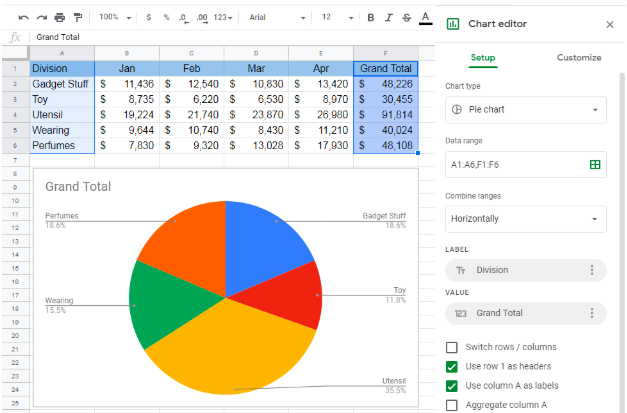 Figure 18. How to Make a Pie Chart in Google Sheets
- Click on Customize tab, select Chart & axis titles and enter the desired Chart title and its formats.
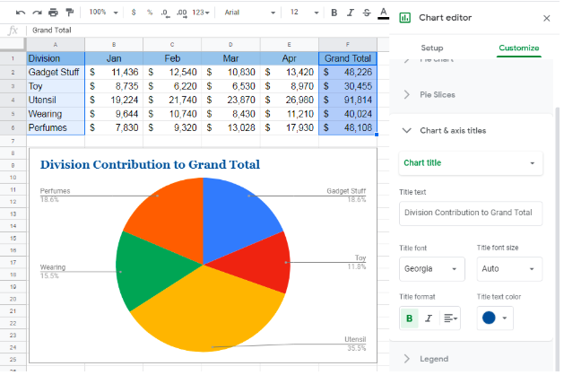 Figure 19. Editing Pie Chart Title and Formats in Google Sheets
Instant Connection to an Expert through our Excelchat Service
Most of the time, the problem you will need to solve will be more complex than a simple application of a formula or function. If you want to save hours of research and frustration, try our live Excelchat service! Our Excel Experts are available 24/7 to answer any Excel question you may have. We guarantee a connection within 30 seconds and a customized solution within 20 minutes.


Leave a Comment