

A box and whisker plot (box plot) shows data distribution in terms of median, minimum and maximum values, and the two quartiles: first and third. It quickly shows how our data is spread out, if it is symmetric or skewed.
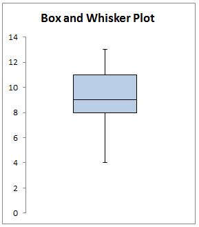 Figure 1. Final result: Box plot
Preparing data to create a boxplot
These are the required data points for a box and whiskers plot:
- Median – the middle value in our data set
- First quartile – 25th percentile
- Third quartile – 75th percentile
- Minimum – the lowest value in our data set
- Maximum – the largest value in our data set
Suppose we have below table of values in cells B3:B13. We then compute our required data using the functions MEDIAN, QUARTILE, MIN and MAX, as shown in Column F.
 Figure 2. Data for boxplot
From the above data, we are able to prepare the charts that we are going to plot. We will need to plot the following:
- Hidden box, whose value or height is equal to Q1
- Lower Box, equal to Median – Q1
- Upper Box, equal to Q3 – Median
- Top Whisker, equal to Maximum – Q3
- Bottom Whisker, equal to Q1 – Minimum
 Figure 3. Chart values for boxplot
How to create a boxplot?
In newer Excel versions 2016 and 2013, the box and whisker plot chart type is already available. However, it is still better to learn how to create a boxplot using only the Column Chart.
With all the relevant values prepared, we can now create a box and whisker plot in Excel version 2016, 2013, or lower.
Plot the three boxes stacked on top of each other
Step 1. Select cells D10:E12, click Insert tab > Column > Stacked Column
 Figure 4. Stacked column in Insert tab
A chart showing three columns will be created.
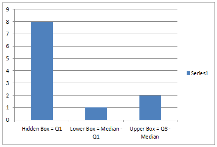 Figure 5. Insert column charts
Step 2.
Click the chart, Design tab > Switch Row/Column
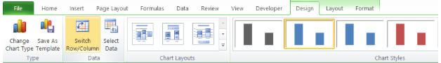 Figure 6. Switch Row/Column option in Design tab
A stacked column will be created.
 Figure 7. stacked column
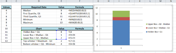 Figure 8. Output: Stacked boxes for boxplot
Insert the whiskers
Step 3. Select the upper box, click Layout > Error Bars > More Error Bars Options
 Figure 9. Error Bars in Layout tab
The Format Error Bars dialog box will appear.
Step 4. Click Vertical Error Bars
- Display Direction > Plus
- Error Amount > Custom > Specify value
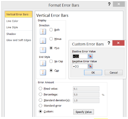 Figure 10. Customize top whiskers for boxplot
The Custom Error Bars dialog box will appear.
Step 5. In the Positive Error Value, click then select cell E13. Click OK.
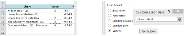 Figure 11. Custom positive error value for whiskers
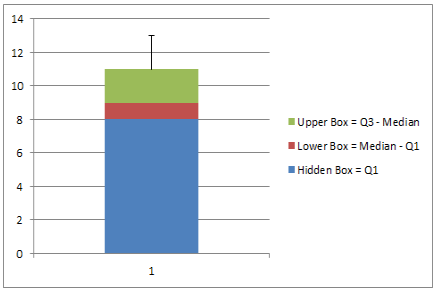 Figure 12. Output: Top whisker added
Step 6. Select the lower box, click Layout > Error Bars > More Error Bars Options
Step 7. In Format Error Bars, do the following:
- Click Vertical Error Bars
- Display Direction > Minus
- Error Amount > Custom > Specify value > Negative Error Value
- Click
![]() and select cell E14
and select cell E14
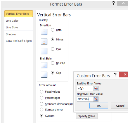 Figure 13. Custom negative error value for whiskers
Our box and whisker plot is now coming together.
 Figure 14. Output: Bottom whisker added
Customize boxplot
Step 8. Next, we customize and clean up our graph by doing the following:
- Right-click the Hidden box (blue) and select Format Data Series
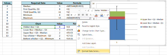 Figure 15. Format Data Series in Menu options
- In Format Data Series, click Fill and select No Fill
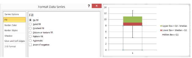 Figure 16. Hide bottom box to show whisker
- Click the upper box and change Fill Color to Blue, Accent 1, Lighter 60%
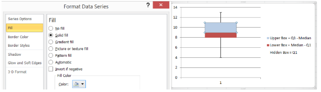 Figure 17. Customize upper box fill color for boxplot
- Click Border Color > Solid Line > Black
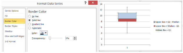 Figure 18. Customize upper box border color for boxplot
- Do the same for the lower box: change fill color to Blue, Accent 1, Lighter 60% and Border Color to Black
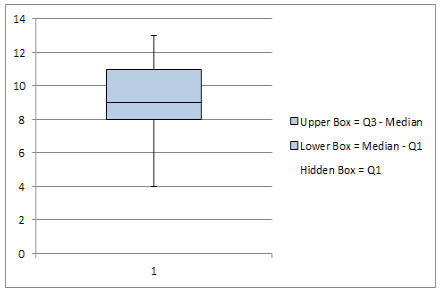 Figure 19. Output: Customize boxes and whiskers for boxplot
- Delete the legend and the horizontal axis
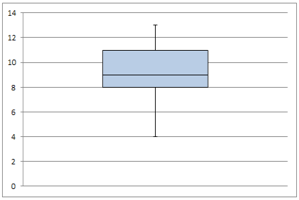 Figure 20. Delete legend and horizontal axis
- Add a chart title by clicking Layout tab > Chart Title > Above Chart
 Figure 21. Output: Box plot
Finally, we have created a box plot.
Instant Connection to an Excel Expert
Most of the time, the problem you will need to solve will be more complex than a simple application of a formula or function. If you want to save hours of research and frustration, try our live Excelchat service! Our Excel Experts are available 24/7 to answer any Excel question you may have. We guarantee a connection within 30 seconds and a customized solution within 20 minutes.


Leave a Comment