

One helpful tip in improving dashboard presentation is by creating combination charts. Excel allows us to combine different chart types in one chart. This article assists all levels of Excel users on how to create a bar and line chart.
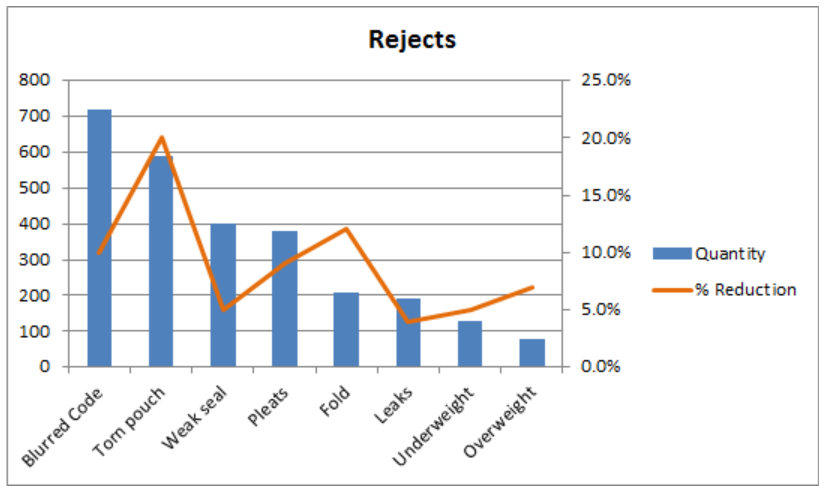 Figure 1. Final result: Bar and Line Graph
Bar Chart with Line
There are two main steps in creating a bar and line graph in Excel. First, we insert two bar graphs. Next, we change the chart type of one graph into a line graph.
Insert bar graphs
- Select the cells we want to graph
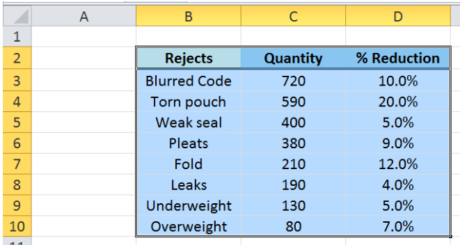 Figure 2. Selecting the cells to graph
- Click Insert tab > Column button > Clustered Column
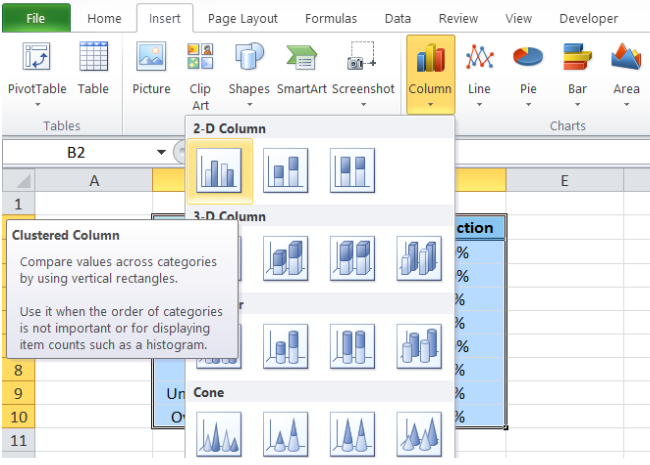 Figure 3. Clustered Column in Insert Tab
Two column charts or vertical bar charts will be created, one each for Quantity and %Reduction.
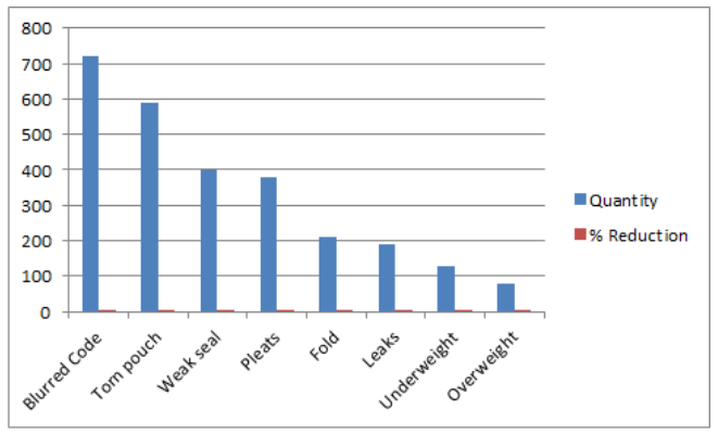 Figure 4. Vertical Bar Graph
Change bar graph to line graph
We want to present %Reduction as a line graph.
- We right-click on the series “% Reduction” and select Change Series Chart Type
 Figure 5. Change Series Chart Type in Menu Options
- The Change Chart Type dialog box will appear. Select Line > Line with Markers
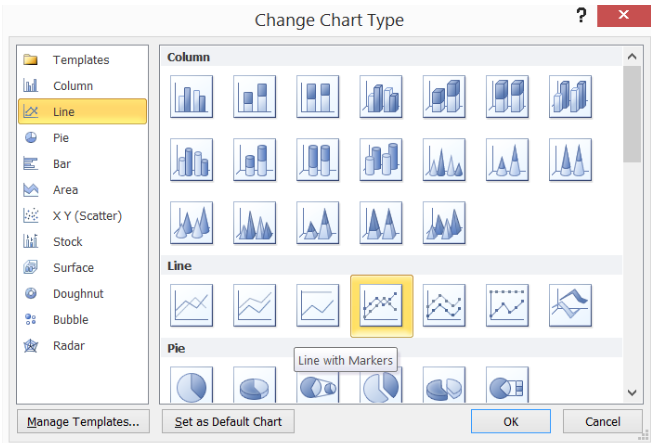 Figure 6. Line with Markers Chart Type
The %Reduction bar graph is now presented as a line graph. However, since the values are less than one, the line graph values are too close to the horizontal axis to be visually significant.
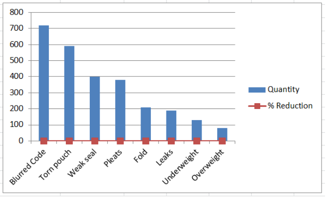 Figure 7. Bar Chart with Line
Display line graph scale on secondary axis
The work-around is to plot the line graph on a secondary axis.
- Right-click the line graph and select Format Data Series.
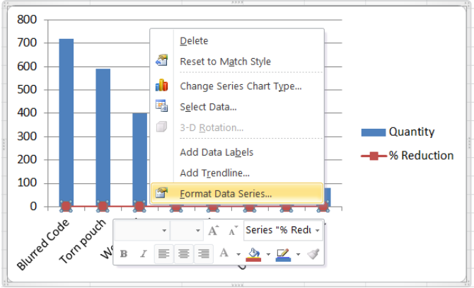 Figure 8. Format Data Series Option
- The Format Data Series dialog box will pop-up. Tick Secondary Axis in Series Options.
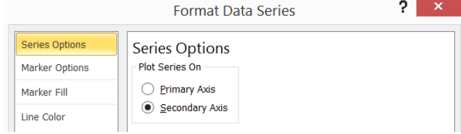 Figure 9. Secondary Axis in Series Options
We now have a combination bar and line graph.
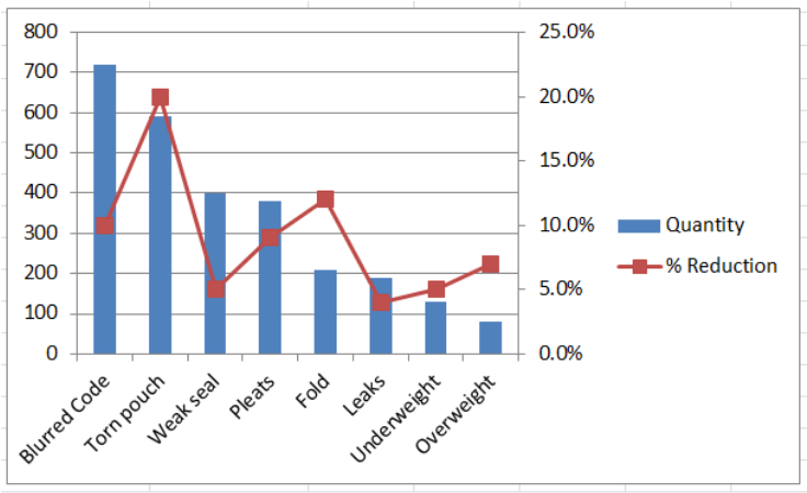 Figure 10. Bar and Line Graph with Secondary Axis
Next let us clean up our bar and line graph by doing the following:
- In Format Data Series, choose Marker Options > Marker Type > None
- Marker Color > Solid Line > Orange
- Delete the gridlines
- Add a chart title in Layout tab > Chart Title > Above Chart, then type “Rejects”
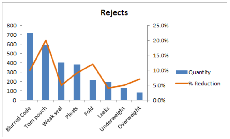 Figure 11. Output: Bar Chart with Line
Instant Connection to an Excel Expert
Most of the time, the problem you will need to solve will be more complex than a simple application of a formula or function. If you want to save hours of research and frustration, try our live Excelchat service! Our Excel Experts are available 24/7 to answer any Excel question you may have. We guarantee a connection within 30 seconds and a customized solution within 20 minutes.


Leave a Comment